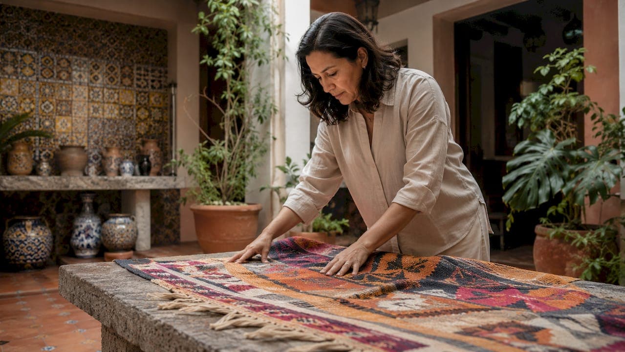
Mexican color symbolism in home decor is defined as the intentional use of culturally coded hues, where each color carries a specific meaning rooted in Mexican heritage, spiritual tradition, and the natural world. Red signals passion and sacrifice. Yellow and orange evoke the sun, hope, and life. Green speaks to nature and abundance. White represents purity and peace. Purple connects to mourning and spirituality. These are not decorating choices made for trend. They are a visual language spoken through walls, textiles, tiles, and handcrafted objects, and understanding them transforms how you style any space.
1. What is Mexican color symbolism in home decor?
Mexican color symbolism in home decor draws from a pre-Hispanic chromatic system where colors connected to fertility, nature cycles, and spiritual communication. This was never purely decorative. Colors carried meaning the way words carry meaning, and that tradition survived centuries of cultural change.
In modern Mexican interiors, this symbolism shows up in every surface. A deep red wall in a dining room is not just bold. It is a reference to vitality and the sacrifices that sustain life. A yellow kitchen does not just feel sunny. It honors the sun as a source of hope and renewal. Knowing this context gives you a foundation for making choices that feel authentic rather than borrowed.
The recognized design term for this practice is cromatismo mexicano, or Mexican chromaticism. It describes the full-saturation, culturally grounded use of color as a structural element of interior space, not a finishing touch.
2. Red: passion, sacrifice, and warmth
Red is the most emotionally charged color in the traditional Mexican color palette. It represents passion, sacrifice, and the life force that runs through both human experience and the natural world. In pre-Hispanic culture, red was tied to blood, fertility, and the sun's power at dusk.
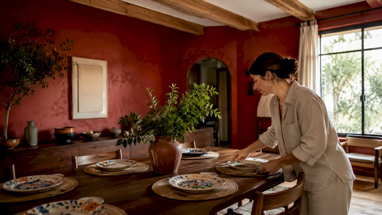
In home decor, red works best as a full-wall treatment in social spaces like dining rooms and living areas. It creates warmth and draws people together. Paired with dark wood furniture and terracotta floor tiles, red walls feel grounded rather than aggressive. Handwoven textiles in crimson and rust tones carry this symbolism into softer furnishings without overwhelming a room.
Pro Tip: Use a matte finish on red walls to absorb light and deepen the color's richness. Glossy red reads as commercial. Matte red reads as intentional and warm.
3. Yellow and orange: the sun, hope, and life
Yellow and orange represent the sun, hope, and the cycle of life in Mexican decor color meanings. These colors appear throughout Mexican festivals, markets, and sacred spaces because they carry the energy of renewal. Marigold orange, in particular, is the color of Día de los Muertos altars, where it guides spirits home.
In interiors, yellow and orange work beautifully on accent walls, kitchen cabinetry, and woven textiles. A terracotta orange paired with cobalt blue is one of the most iconic Mexican color pairings, seen in Talavera tiles and traditional embroidery. This combination creates visual energy through contrast at full saturation, which is a defining feature of authentic Mexican design.
Orange also reads as deeply hospitable. Rooms with warm orange tones feel welcoming in a way that cooler palettes rarely achieve.
4. Green: nature, abundance, and hope
Green in Mexican symbolism connects directly to the natural world, representing abundance, growth, and hope. It appears in the Mexican flag as a symbol of independence and the fertility of the land. In home decor, green grounds a space and brings the outside in.
Deep forest greens and sage tones work well on walls in bedrooms and reading spaces, where calm and renewal are the goal. Bright lime greens appear in folk art and textiles, where they create contrast against warm reds and oranges. Incorporating green through handcrafted pottery, embroidered cushions, or painted tiles lets you honor this symbolism without committing to a full wall treatment.
Green also pairs naturally with terracotta and raw wood, two materials that anchor the cultural significance of colors in Mexican interiors by providing an earthy counterweight to saturated hues.
5. White: purity, peace, and architectural clarity
White in Mexican design carries meanings of purity and peace. It also serves a structural role. Lime plaster walls in white or off-white are a traditional building material in Mexico, and their texture creates depth that flat paint cannot replicate. White is not neutral in this context. It is a deliberate choice that allows bold colors to breathe.
In practice, white walls act as a canvas for vibrant Mexican decor elements. A white room with cobalt blue Talavera tiles, a red textile, and a yellow ceramic vase creates a space that feels curated rather than chaotic. White also reflects the spiritual dimension of Mexican aesthetics, where clean, open spaces are associated with clarity of mind and spirit.
6. Purple: mourning, spirituality, and depth
Purple holds a specific and serious place in Mexican color symbolism. It is associated with mourning, spirituality, and the connection between the living and the dead. This is not a color to use carelessly. In Mexican tradition, purple appears in religious ceremonies and on altars during periods of remembrance.
In home decor, purple works best in spaces meant for reflection, such as a study, a meditation corner, or a bedroom. Deep plum and violet tones pair well with gold accents and dark wood, creating a space that feels both rich and contemplative. Used sparingly, purple adds a layer of cultural depth that most Western interiors never achieve.
7. Mexican Pink: vitality, volume, and cultural identity
Mexican Pink, known as Rosa Mexicano, is a cultural icon in design. Its magenta-register vibrancy evokes volume and vitality in a way that distinguishes it entirely from typical pink tones. Architectural historian Rafael Montilla identifies it as a design tool that symbolizes life-force and pleasure, directly contrasting the minimalist global palettes that dominate contemporary interiors.
This color was popularized by Mexican architect Luis Barragán, who used it on full exterior and interior walls to create spaces that felt alive. In home decor, Rosa Mexicano works on a feature wall, in a courtyard, or as the dominant color in a textile collection. It is bold without apology, and that confidence is precisely the point.
Pro Tip: Pair Rosa Mexicano with terracotta, white lime plaster, and raw wood to keep the space grounded. Without natural materials as anchors, the color can feel overwhelming.
8. Authentic color pairings in traditional Mexican decor
The most effective color combinations in Mexican design work through contrast at full saturation. The following table outlines the key pairings, their symbolic meaning, and where they appear most naturally in a home.
| Color pairing | Symbolic meaning | Best application |
|---|---|---|
| Cobalt blue + terracotta orange | Spiritual depth meets solar energy | Talavera tiles, kitchen walls, textiles |
| Rosa Mexicano + white lime plaster | Vitality balanced by purity | Feature walls, courtyards, entryways |
| Forest green + raw wood | Nature and abundance grounded in earth | Bedrooms, reading rooms, shelving |
| Deep red + dark wood | Passion anchored by tradition | Dining rooms, living areas |
| Yellow + cobalt blue | Hope meeting spiritual depth | Pottery, cushions, decorative accents |
These pairings are not arbitrary. Each combination reflects a dialogue between symbolic meanings, where one color's energy is balanced or amplified by its partner. Applying them at full saturation, rather than as diluted pastels, is what gives Mexican interiors their characteristic warmth and presence.
Pro Tip: When combining two saturated colors, let one dominate at roughly 70% of the visual field and use the second as an accent. This creates balance without flattening the impact.
9. How materials and architecture amplify color symbolism
Mexican design applies color to structural surfaces, not just accessories. Full-saturation color on walls, floors, and ceilings creates immersive, warm spaces inside thick-walled homes. This approach contrasts sharply with Western design conventions, where color typically appears as an accent rather than a defining architectural element.
Natural materials are what make this intensity livable. Raw wood, unglazed clay, and lime plaster anchor strong colors by providing textural contrast and visual rest. Saltillo tiles, with their warm, uneven terracotta tones, ground even the most saturated wall colors. Lime plaster walls absorb and diffuse light differently than painted drywall, softening bold hues and adding depth.
Talavera pottery brings color symbolism into three-dimensional form. Its bold blues and intricate patterns blend Spanish and Indigenous influences, making each piece a carrier of cultural history. Incorporating Talavera tiles into a kitchen backsplash or bathroom floor is one of the most direct ways to bring authentic Mexican chromaticism into a contemporary home.
Highly saturated stucco walls also serve a practical purpose. Bright, saturated exteriors reflect less sunlight and help keep interiors cooler in Mexico's tropical climate. The aesthetic choice and the functional choice are the same choice. That integration of beauty and purpose is a hallmark of authentic Mexican design.
10. Practical ways to incorporate Mexican color symbolism today
Bringing Mexican color symbolism into a modern home does not require a full renovation. The following approaches let you honor the tradition at any scale.
- Anchor a room with one symbolic color. Choose a single wall in a social space and paint it at full saturation. Red for a dining room, yellow for a kitchen, or cobalt blue for a living area. Let that color set the room's emotional tone.
- Use handcrafted textiles as color carriers. Embroidered cushions, woven throws, and hand-loomed rugs bring symbolic colors into a space without permanent commitment. They also carry the artisan heritage that gives these colors their meaning. Explore how Mexican crafts pair with contemporary furniture for specific guidance on this approach.
- Ground bold colors with natural materials. Place Saltillo tiles, untreated wood furniture, or unglazed clay pottery alongside any saturated wall color. These materials absorb visual intensity and keep the space feeling warm rather than loud.
- Incorporate Talavera pottery and tiles as focal points. A Talavera tile backsplash or a collection of hand-painted pottery brings cobalt blue and terracotta orange into a kitchen or bathroom with cultural specificity.
- Respect the symbolism of purple and white. Use purple in spaces meant for reflection, not high-traffic social areas. Use white as a structural element that gives bold colors room to speak, not as a default neutral.
- Layer colors through depth, not quantity. Two or three symbolic colors used with intention create more impact than six colors used casually. Restraint in selection, combined with confidence in application, is the defining quality of authentic Mexican chromaticism.
Understanding the Mexican artisan craft tradition behind these choices deepens your ability to apply them with genuine respect and confidence.
Key takeaways
Mexican color symbolism in home decor is a culturally grounded design language where each hue carries specific meaning, and authentic application requires full saturation, natural materials, and intentional pairing.
| Point | Details |
|---|---|
| Each color carries specific meaning | Red, yellow, green, white, and purple each represent distinct aspects of Mexican heritage and life. |
| Full saturation is the standard | Apply symbolic colors to entire walls and surfaces, not just accents, for authentic impact. |
| Natural materials ground bold hues | Saltillo tiles, raw wood, and lime plaster balance saturated colors and keep spaces warm. |
| Contrast pairings define the palette | Cobalt blue with terracotta orange and Rosa Mexicano with white are the signature combinations. |
| Symbolism guides placement | Purple belongs in reflective spaces; red and yellow suit social, high-energy rooms. |
Why Mexican color symbolism still matters in 2026
I have spent years studying how color shapes the feeling of a space, and nothing has taught me more than Mexican chromaticism. Most Western design treats color as a finishing layer, something you add after the real decisions are made. Mexican design treats color as the decision. That shift in thinking changes everything.
What strikes me most is how the symbolism is not decorative mythology. It is a living system. Towns like Guanajuato and Oaxaca actively preserve their bold color palettes through government programs because those colors are understood as cultural identity, not just aesthetics. When you bring that same intentionality into a home, you are participating in something much larger than interior design.
The mistake I see most often is treating Mexican color as a mood board trend. People pull the colors without the materials, the symbolism, or the cultural context, and the result feels like a costume rather than a home. The colors work because of what surrounds them. Terracotta underfoot, lime plaster on the walls, handcrafted textiles on the furniture. Remove those anchors and the palette loses its soul.
My honest recommendation: start with one room, one symbolic color, and one authentic material. Learn how they interact. Then build from there. The soulful quality of handcrafted Mexican goods is not accidental. It comes from generations of understanding exactly how color, material, and meaning work together.
— Ernesto
Bring authentic Mexican color into your home with Createdecorus

Createdecorus handcrafts luxury pillows and home accents in Mexico using the symbolic color palettes described throughout this article. Each piece is made with the bold hues, rich textures, and artisan care that define authentic Mexican chromaticism. A cobalt blue embroidered pillow or a Rosa Mexicano woven cushion does more than add color to a room. It carries a piece of cultural heritage into your daily life. If you are ready to bring that depth and warmth into your home, explore the full collection of handcrafted luxury pillows at Createdecorus, or browse every available design at the complete pillow shop.
FAQ
What colors are most symbolic in Mexican home decor?
Red, yellow, green, white, and purple each carry distinct cultural meanings in Mexican decor, representing passion, solar energy, nature, purity, and spirituality respectively. Mexican Pink, known as Rosa Mexicano, also holds strong cultural identity as a symbol of vitality and life-force.
Why are Mexican interior colors so saturated and bold?
Traditional Mexican design applies color at full saturation to entire walls, floors, and ceilings rather than using it as an accent. Highly saturated stucco walls also reflect less sunlight, helping keep interiors cooler in Mexico's tropical climate, so the bold aesthetic serves a practical purpose as well.
What is the most iconic Mexican color combination?
Cobalt blue paired with terracotta orange is the signature color pairing in Mexican design, seen in Talavera tiles and traditional textiles. This combination creates visual energy through contrast at full saturation and carries both spiritual and solar symbolism.
How do I use Mexican color symbolism without overdoing it?
Choose one symbolic color to anchor a room, then ground it with natural materials like Saltillo tiles, raw wood, or lime plaster. Introduce secondary colors through handcrafted textiles and pottery rather than additional painted surfaces.
What is Rosa Mexicano and how is it used in decor?
Rosa Mexicano is a magenta-register pink that functions as a cultural icon in Mexican design, symbolizing vitality and life-force. It works best as a full feature wall or dominant textile color, balanced by white lime plaster and natural wood tones.