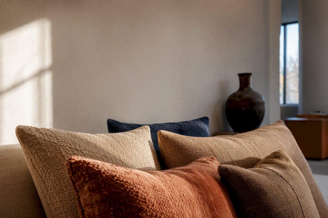
To personalize your cushion palette quickly, pick one neutral base, one strong accent, and one textured fabric that plays against the others. That single combination changes a sofa's whole mood without a full redecorating budget. Handcrafted options, like the curated sets from Createdecorus, give you this formula already balanced and color matched if you'd rather skip the trial and error.
TL;DR:
- Using at least two distinct fabrics enhances visual depth and prevents a flat, uniform look, especially when combined with colors chosen for texture and tactile appeal.
- The recommended cushion sizes start with one large statement piece for anchoring and smaller accents for contrast, with layering of sizes creating a well-balanced arrangement.
- Natural light dramatically influences cushion color perception, so testing colors under room-specific lighting conditions before purchasing is essential.
- Handcrafted cushions with artisan textiles and durable fillings retain their color and shape longer than mass-produced options, making them a better long-term investment.
- Prioritizing texture variation over more color accents results in a more sophisticated, layered look, with curated sets available for those seeking ready-made solutions.
Table of Contents
- How Do You Choose a Cushion Color Palette?
- Which Fabrics Pair Best With Your Colors?
- How Many Cushions Should You Use, and Where?
- DIY Techniques to Customize Cushion Covers
- When Should You Rotate Cushion Covers by Season?
- Why Handcrafted Cushions Hold Their Color and Shape Longer
- Does Cushion Size and Shape Really Affect the Look?
- How Does Room Lighting Change Your Cushion Palette?
- What Mistakes Should You Avoid When Customizing a Palette?
- An Editorial Take on the 2026 Cushion Trend
- Ready-Made Palettes When You'd Rather Skip the Trial and Error
- Sources
How Do You Choose a Cushion Color Palette?
Start with the room, not the cushions. Look at what's already there. Your rug, your artwork, the wood tone of your floor, even a favorite plant, all carry colors you can pull directly into your cushion covers. This is the fastest way to guarantee your new palette feels intentional instead of accidental.
Interior designers lean on the 60/30/10 rule to keep that intention organized: 60% of your color scheme comes from a dominant neutral (think sand, cream, or warm gray), 30% from a secondary supporting tone, and 10% from a punch of accent color that carries the whole look. Applied to cushions, that usually means two or three neutral covers, one or two in a secondary shade, and a single bold accent cover doing the heavy lifting.
A few dependable templates to build from:
- Neutral plus two accents: oatmeal linen, terracotta, and deep blue
- Tonal: three shades of the same warm brown, varied only by texture
- High contrast: sand base with one olive cushion and one near-black accent
For 2026, the colors gaining ground are warm and earthy: terracotta, olive, warm brown, and sand, all colors that photograph beautifully against natural light and read as considered rather than trendy.
Which Fabrics Pair Best With Your Colors?
Color gets the credit, but texture does the real work of making a cushion arrangement feel finished. A flat cotton print in the right shade still looks unfinished next to a set that mixes bouclé, velvet, and linen, because texture creates the visual depth that color alone can't.
Season plays a role here too. Heavier textures like velvet and wool-blend weaves suit fall and winter rooms, adding warmth that pairs naturally with wool and velvet swaps recommended for the colder months. Linen and cotton lighten the same room for spring and summer without changing your color story at all.
Mixing at least two distinct fabrics in one set adds richness without adding a single new color, which is why designers often reach for texture before they reach for a new hue. A terracotta velvet paired with a sand linen cushion, for instance, looks more expensive than two flat cottons in the same shades, even though the palette hasn't changed. Warmer, tactile fabrics also affect how a room feels physically. Nubby, dense weaves genuinely read as warmer than smooth, thin ones, which matters more in a north-facing living room than most people realize.
- Velvet and bouclé: best for winter warmth and visual weight
- Linen and cotton: best for breathable, casual summer looks
- Wool blends: durable, forgiving of daily use, but need occasional brushing to stay fresh
Pro Tip: Before committing to a full set, buy one cushion in your intended accent fabric and live with it for a week. Lighting changes how bold colors read far more than swatches ever show.
How Many Cushions Should You Use, and Where?
Odd numbers read as styled; even numbers read as leftover. The rule of three is the simplest way to avoid a stiff, symmetrical look on any sofa longer than a loveseat.
- Two-seater sofa: two cushions, one large square (around 20 by 20 inches) and one smaller lumbar or accent
- Three-seater sofa: three to five cushions, mixing a large base size with smaller accents
- Sectional: five to seven cushions, grouped in clusters of three per section rather than spread evenly
- Single chair: one or two cushions, max, so the seat stays usable
A common expert approach layers sizes deliberately, pairing a 65x65 cm base cushion with a 50x50 cm transition piece and a smaller 30x50 cm lumbar accent. Larger, darker cushions anchor the corners; smaller, brighter ones cluster toward the center. Try a symmetrical layout on a formal sofa, or push one bold cushion off to a single side for an asymmetrical look that feels more current.
DIY Techniques to Customize Cushion Covers
You don't need a sewing studio to change how a cushion looks. Most effective DIY methods rely on tools most home decorators already have on hand, plus a few inexpensive extras.
Dip-dyeing cotton or linen covers:
- Wash the cover first to remove any factory finish that blocks dye absorption.
- Mix a fabric dye suited to natural fibers, following the ratio on the package exactly.
- Dip only the bottom third or half of the cover for a gradient effect, holding it steady for even color.
- Rinse in cold water until it runs clear, then set with a vinegar rinse to help lock in color before washing again.
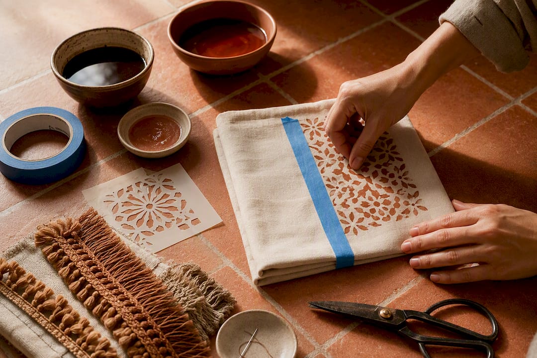
Stenciling and fabric paint:
- Tape a stencil firmly to the cover so paint can't bleed underneath.
- Use fabric paint made for the material (cotton takes paint differently than polyester blends).
- Apply thin layers rather than one thick coat, and let each dry fully.
- Heat set with an iron on the reverse side once the design is finished.
Sewn additions: Piping along a seam, a row of pom-pom trim, or a small hand-stitched appliqué motif can update a plain cover in an afternoon. Attach trim with a straight stitch close to the folded edge, and reinforce corners twice since that's where trim tends to loosen first.
Mixing thrifted covers with new ones extends a budget further, and no one can tell a terracotta cover came from a secondhand shop once it sits next to a matching velvet accent. A basic supply kit covers most of this: fabric dye, painter's tape, stencils, fabric paint, coordinating trim, a hand-sewing needle, and fabric shears.
When Should You Rotate Cushion Covers by Season?
Swapping covers is the most cost-effective way to refresh a living space, cheaper and faster than buying new furniture or repainting a wall — a strategy well explained in Refresh Your Space Without the Renovation Headache | One Day Doors & Closets.
- Winter: bring in wool, velvet, and deeper tones like warm brown and deep blue
- Summer: switch to linen and cotton in lighter sand or olive shades
- Storage: keep off-season covers dry, out of direct sunlight, and in breathable bags rather than sealed plastic, which traps moisture. A seasonal storage guide covers this in more depth if you're rotating a full set.
- Care: spot-clean stains immediately, wash on a gentle cycle when the fabric allows, and rotate cushions regularly so sunfading and pilling don't concentrate on one side
Rotating covers costs far less than replacing fillings, but if a foam insert has gone flat or lumpy, that's the one component worth replacing outright rather than patching.
Why Handcrafted Cushions Hold Their Color and Shape Longer
Mass-produced covers often use flat-dyed fabric that fades unevenly and fillings that compress within a season. Createdecorus takes a different approach, handcrafting luxury pillows and home accents in Mexico with artisan-selected textiles chosen specifically for color depth and how they hold up over years of daily use, not just how they photograph on day one.
A cover is only as good as what's inside it. Artisan-selected fabric holds richer color because the dye process and weave density are chosen for the fabric, not applied generically across a factory batch, and a well-made filling keeps its shape long after a mass-produced insert has gone flat.
DIY techniques are worth every hour when you're testing a trend or refreshing a room on a budget. But when you want a terracotta or olive tone that won't shift after three washes, or a filling that still feels full a year later, that's when a handcrafted piece earns its price. Ernesto, who covers home design and craftsmanship for Createdecorus, sees this as the real dividing line between a fun weekend project and a lasting investment.
Does Cushion Size and Shape Really Affect the Look?
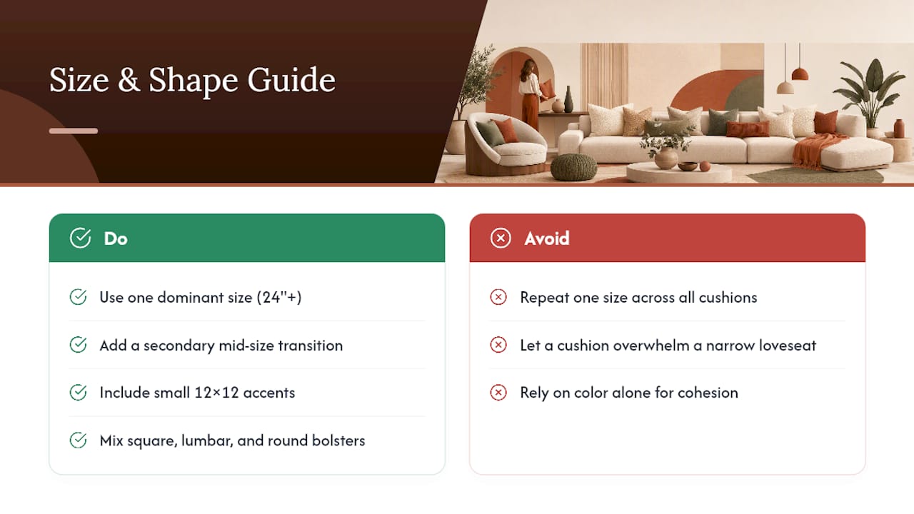
Color gets the attention, but size and shape decide whether that color actually looks intentional. A palette can be flawless on paper and still look off if every cushion on the sofa is the same square size.
Mixing shapes creates the same depth that mixing textures does. A round bolster next to a square accent breaks up what would otherwise be a flat, repetitive line of identical squares. Lumbar cushions, the long rectangular ones, work especially well tucked behind or beside larger squares because they add a horizontal line that squares alone can't provide.
Scale matters just as much as shape. A single oversized cushion (24 inches or larger) reads as a statement piece and can anchor an entire arrangement, while a cluster of small 12 by 12 inch accents feels more like decoration than furniture. The mistake most home decorators make is choosing one size and repeating it across every cushion, which flattens the whole composition. Instead, treat size the way you'd treat your color ratio: one dominant size, a secondary size for transition, and a small accent size for contrast. This mirrors the same layered sizing approach used in placement rules, where a large base cushion, a mid-size transition piece, and a small accent work together rather than competing. A detailed size guide can help you match proportions to your specific sofa depth and arm height, since a cushion that looks right on a deep sectional can overwhelm a narrow loveseat.
How Does Room Lighting Change Your Cushion Palette?
The swatch you loved in the store can look completely different once it's on your sofa, and lighting is almost always the reason. North-facing rooms receive cooler, bluer natural light, which mutes warm tones like terracotta and can make olive read closer to gray. South-facing rooms get warmer light that intensifies warm accents but can wash out cooler blues.
Artificial lighting complicates this further. Warm-temperature bulbs (around 2700K, the soft yellow-toned kind) flatter earthy palettes and deepen browns and terracottas in the evening. Cooler bulbs (4000K and up) sharpen blues and grays but can make warm accent colors look dull or brownish after dark. If your living room relies mostly on lamps in the evening, test your cushion colors under that exact lighting before committing to a full set, not just under daylight.
Existing decor sets the ceiling on how bold you can go. A room with patterned wallpaper or a busy rug needs a quieter cushion palette, one or two supporting tones rather than three competing accents. A neutral room with plain walls and simple furniture can handle a bolder terracotta or deep blue statement cushion without feeling cluttered. The goal is matching your cushion palette to what the room can visually support, not just what looks good on its own.
What Mistakes Should You Avoid When Customizing a Palette?
The most common misstep is choosing three or four accent colors with equal visual weight. Without a dominant neutral anchoring the set, even beautiful individual colors compete instead of cooperating, and the sofa ends up looking busy rather than styled.
A close second: matching colors too literally. Pulling the exact same blue as your rug into a cushion cover often looks flat rather than coordinated. A near match, a slightly deeper or warmer version of that blue, reads as intentional design rather than an exact color-matching exercise.
Ignoring texture is another frequent oversight. A set of four cushions in perfectly chosen colors but identical smooth cotton fabric looks unfinished next to a set that mixes velvet, bouclé, and linen, even when the color story is weaker.
Sizing mistakes compound quickly too. All-square, all-same-size arrangements flatten a composition, and oversized cushions on a narrow loveseat overwhelm the seat rather than complementing it.
Finally, skipping colorfastness tests before dyeing or painting a cover is the mistake that costs the most to fix. A cover that bleeds color onto a light sofa arm, or fades unevenly after the first wash, undoes hours of careful DIY work. Test on a scrap swatch or an inside seam first, every time.
An Editorial Take on the 2026 Cushion Trend
The conventional advice on cushion styling has always centered on color first: pick a palette, match it to your walls, done. That advice undersells what's actually driving the best living rooms in 2026. Texture is doing more visual work than color choice alone, and treating fabric as an afterthought is the biggest miscalibration in most DIY cushion projects.
Warm, earthy accents like terracotta and olive succeed largely because they were chosen alongside tactile fabrics, bouclé, velvet, heavier linen, not despite ignoring them. A flat cotton terracotta cushion and a velvet one in the same shade are not interchangeable; one reads as an afterthought, the other as a considered choice.
If you take one thing from this, prioritize texture variation before you chase a fourth accent color. Two well-chosen fabrics in a tight, disciplined palette will outperform four colors in matching flat cotton every time. That's also where a handcrafted option earns its keep: the fabric selection is already done by someone who thinks about color and texture together, not sequentially.
— Ernesto
Ready-Made Palettes When You'd Rather Skip the Trial and Error
DIY dyeing and stenciling get you most of the way there, but color depth and fabric durability are where handmade work shows its advantage. Createdecorus builds its curated pillow sets around exactly the texture-forward, warm-toned palettes covered above, terracotta, olive, warm brown, and sand, already balanced using the 60/30/10 ratio and paired across at least two fabrics per set.

Every piece uses artisan-selected textiles and premium fillings, memory foam or polyester blends, shipped vacuum-compressed so covers arrive ready to place. Custom color matching is available if you have a specific rug or artwork you're building around, and wholesale pricing exists for designers or boutiques ordering in volume. If your weekend dye project turned out more uneven than intended, or you'd simply rather start with a set that's already color-correct and durable, browse the curated pillow collection or visit Createdecorus to request a custom consultation for your exact palette.
Sources
- Cojines, cómo ponerlos en 2026 | Architectural Digest
- Cómo combinar los cojines para actualizar tu sofá
- Cómo combinar los cojines como un decorador de interiores