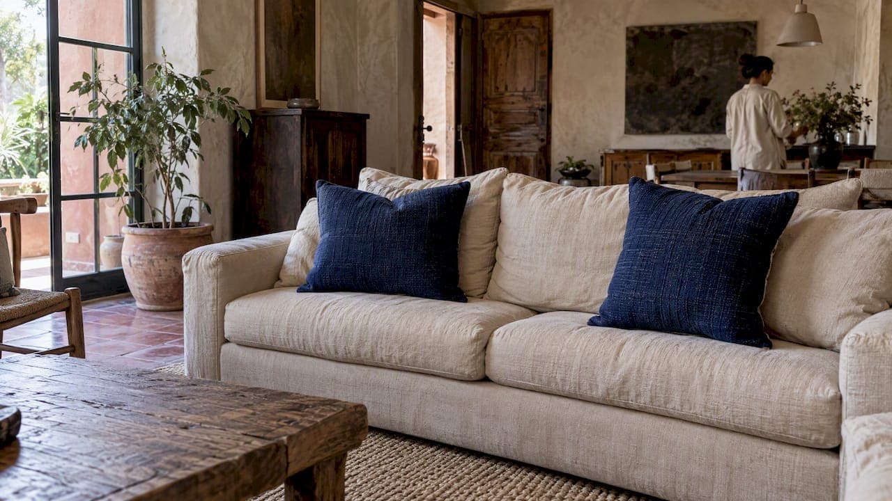
To get a balanced, luxe look with jewel tone pillows, choose one dominant jewel color, pair it with a complementary jewel, and finish with a small neutral or metallic accent. This gives you a richer, more intentional arrangement without tipping into visual clutter. Start simple: swap one solid pillow for a jewel tone, or add a single lumbar in amethyst or emerald, and build from there.
TL;DR:
- Use two dominant color squares, two smaller complementary pillows, and one neutral or metallic lumbar on a standard sofa; queen beds usually need three.
- Choose inserts 1 to 2 inches larger than covers for full corners; match the cover size more closely when you prefer a softer, slouched shape.
- Velvet shifts with light, so place it near a window or angled ambient light; use linen, cotton, or embroidery when saturated colors need restraint.
- When furniture or art already draws attention, use one jewel tone pillow; formal rooms often benefit from a single accent rather than a full palette.
Table of Contents
- Why Jewel Tones Work in a Room
- Palette Recipes That Work Every Time
- How Many Pillows and What Sizes to Choose
- Materials and Texture That Make Jewel Tones Sing
- Arranging Pillows by Furniture Type
- Maker Notes: How We Build Jewel Tone Pillows to Last
- When to Go Bold and When to Pull Back
- Bring the Look Home with Create Decorus
- FAQ
- Sources
Why Jewel Tones Work in a Room
Jewel tones take their name from gemstones: emerald, sapphire, amethyst, ruby, and topaz among them. They read as deep, richly saturated colors that carry more visual weight than pastels, which is exactly why they feel luxurious rather than loud when handled with care, as ColorVio's color guide notes. The saturation does the work. A sofa that leans on muted beige suddenly has somewhere to look.
The right foundation makes these colors sing instead of shout. Deep neutrals like charcoal and navy ground a jewel tone so it feels anchored, while cream or warm white gives it room to breathe. Metallics, brass, gold, and bronze especially, pick up the gem-like quality and carry light across a seating area.
A simple proportional rule keeps the mix from feeling busy. According to design guidance from Housebeautiful, the most effective approach uses one primary jewel tone for the majority of the arrangement, a secondary complementary jewel for a smaller share, and a neutral or metallic accent for the rest.
In practice, that looks like:
- A dominant jewel tone, such as emerald or sapphire, covering most of your pillow arrangement.
- A secondary jewel, often its complement on the color wheel, used in a smaller pillow or two.
- A neutral or metallic accent, a cream lumbar or a brass-trimmed cushion, closing out the grouping.
That small metallic or neutral piece matters more than its size suggests. It gives the eye a resting point between two saturated colors, which is why designers return to it again and again.
Palette Recipes That Work Every Time
Once you understand the proportional rule, the fastest way to apply it is with a tested recipe. These combinations pull from the same gemstone logic designers use, pairing one dominant jewel with a complementary jewel and a grounding neutral or metallic.
- Emerald, amethyst, and cream with brass accents: emerald dominates, amethyst plays second, cream and brass close the loop.
- Sapphire, teal, and charcoal with gold trim: a cool, moody combination that reads formal and collected.
- Ruby, topaz, and cream with brass: warm and rich, well suited to a living room that gets afternoon light.
- Amethyst, emerald, and ivory with silver accents: a softer jewel pairing that still carries depth.
- Sapphire, ruby, and charcoal with brass: a bold contrast pairing for readers who want drama without going fully monochrome.
- Teal, amber, and cream with gold: an easy transitional palette that works across seasons.
- Emerald, sapphire, and cream with brass: two cool jewels anchored by a warm metallic for balance.
Apply each recipe with the same proportion: the first color listed should dominate the arrangement, the second plays a supporting role, and the neutral or metallic closes it out in the smallest quantity.
Nearly every jewel tone pairs comfortably with warm metallics and deep neutrals, according to ColorVio's breakdown of gemstone colors, which also notes that some jewel tones need white text or trim to read clearly while others sit well with dark accents. That distinction is worth remembering if you add lettered pillows, piping, or tags to your arrangement: a deep sapphire reads better with white or cream trim, while a brighter topaz or amber can carry dark charcoal detailing without losing contrast. For a deeper look at texture-first ratios, our 60/30/10 living room formula breaks the proportions down further.
How Many Pillows and What Sizes to Choose
Scale is where most jewel tone arrangements go wrong. Too many pillows in matching sizes reads flat, while the right mix of counts and sizes makes the whole grouping feel designed rather than assembled.
- For a standard sofa, use the 2-2-1 approach: two matching squares in your dominant jewel tone, two smaller squares or a pair in the secondary jewel, and one lumbar pillow in your neutral or metallic accent.
- For a queen bed, three pillows is the number designers return to most often, according to Housebeautiful's guidance on bed pillow counts: two matching squares plus one contrasting lumbar in front.
- For an accent chair, one statement pillow is usually enough. A single jewel tone pillow against a neutral chair fabric does more work than a cluttered stack.
- For an ottoman, a small layered stack of two or three works, scaled down from whatever grouping sits on the nearby sofa so the room still feels connected.
Standard square sizes run 18x18, 20x20, and 22x22 inches, with lumbar pillows typically falling between 12x20 and 14x24 inches. Mixing a 22x22 with a 20x20 adds subtle depth that two identical squares cannot. On a deep sectional, size up to 22x22 or 24x24 so the pillow does not look lost against the cushion.
Insert sizing is where a lot of arrangements fall short. The common practice among designers is to choose an insert 1 to 2 inches larger than the cover, which fills the corners and gives the pillow a plump, substantial look rather than a deflated one, per Housebeautiful's styling guide. If you prefer a softer, slouched look instead, size the insert closer to the cover itself.

Materials and Texture That Make Jewel Tones Sing
Color gets the attention, but texture decides whether a jewel tone pillow looks expensive or flat. The same emerald green can read as rich velvet or as a cheap poster color depending entirely on fabric choice.
- Velvet is the material most associated with jewel tones because its pile catches and reflects light, deepening the color as the angle changes, according to Architectural Digest's guide to jewel tone decorating. Place velvet pillows where they catch natural or angled ambient light; in a dim corner, the same pillow can look surprisingly flat.
- Linen and cotton calm down a saturated color, which helps when you are working with two bold jewels in the same grouping and need one to step back.
- Embroidered textures add dimension without adding more color, a useful trick when you want visual interest but have already hit your palette limit.
- Metallic trims or piping work best in small doses, a thin brass edge or a stitched gold detail does more for an arrangement than a fully metallic pillow would.
If you are mixing fabrics across a room, our guide on accent rugs versus accent pillows covers how to coordinate texture between floor and seating without one competing against the other.
Seasonal swaps are simple with jewel tones: swap a velvet cover for a linen one in warmer months, keeping the same color family so the room's palette stays consistent year round.

Pro Tip: Hold a velvet jewel tone pillow up near a window before you commit. The way it shifts in natural light will tell you more than any photo online.
Arranging Pillows by Furniture Type
Placement order matters as much as color choice. Working largest to smallest keeps the arrangement looking intentional at every stage, rather than like an afterthought added once the furniture was already in place.
- Start with the largest pillow in your dominant jewel tone, placed in the back corners of a sofa or against the headboard on a bed.
- Add the secondary jewel tone next, slightly smaller and set just in front of or beside the first, creating layered depth rather than a flat row.
- Place the lumbar or accent pillow last, front and center, since it is your neutral or metallic note and should read as the finishing detail, not the starting point.
- Step back and adjust for comfort, fluffing corners and nudging pillows so the grouping still looks inviting to sit against rather than purely decorative.
On a sofa, a symmetrical arrangement with matching pairs on each end reads formal, while an asymmetrical mix, one large jewel pillow on one side and a smaller stack on the other, feels more relaxed. Either way, keep one pillow as the clear hero: the piece that carries the boldest color or the richest texture.
On a queen bed, the classic composition is two matching squares against the headboard with one contrasting lumbar in front, a ratio that echoes the same 2-2-1 logic used on sofas. For throw pillow placement techniques that go deeper into layering order, our styling guide walks through additional variations for different room types.
Accent chairs and ottomans need less: one statement pillow on a chair, or a small two to three piece stack on an ottoman, scaled to match whatever jewel tone recipe you have already established elsewhere in the room.
Maker Notes: How We Build Jewel Tone Pillows to Last
Good styling depends on good construction, and that starts before the pillow ever reaches your sofa. We size our inserts generously, following the same oversizing practice designers recommend, 1 to 2 inches larger than the cover, so every corner fills out fully and holds its shape over time.
Every piece is handcrafted using traditional techniques and artisan textiles, which means the texture choices behind a jewel tone cover are never accidental. We select trims and weave mixes specifically to keep a saturated color looking rich rather than overwhelming, pairing heavier velvets with finer piping so the two textures balance each other.
Luxury is about exceptional materials and thoughtful details, not excess.
Custom and made-to-order options are available, with straightforward care guidance included for keeping velvet and embroidered textures looking their best season after season.
When to Go Bold and When to Pull Back
Jewel tones reward confidence, but confidence is not the same as excess. In a lounge or media room, where the mood is relaxed, I think a full palette recipe earns its place: dominant, secondary, and accent all working together. In a more formal living or dining space, one statement pillow against a neutral sofa often does more than a full grouping, since the room already carries enough visual weight on its own.
A single jewel tone pillow is the better call whenever the surrounding furniture or art is already saying something loudly. Before calling an arrangement finished, I ask three things: does one color clearly lead, does the texture vary enough to catch light differently across the grouping, and would removing any single pillow actually hurt the balance. If the answer to that last question is no, something is extra.
— Ernesto
Bring the Look Home with Create Decorus
Every jewel tone pillow is handcrafted using artisan textiles and traditional techniques, built to carry the kind of richness this styling approach depends on. We focus on exceptional materials and thoughtful detail over excess, which is exactly the balance a jewel tone arrangement needs to feel luxurious rather than loud.

- Browse our full range of decor pillows to find a dominant jewel tone to build around.
- Explore the animal print collection if you want a bold accent pattern alongside your jewel tones.
- Check our wholesale program if you are a designer or retailer sourcing jewel tone pieces for clients.
If lighting is part of your styling plan, especially for velvet pieces that depend on it, this guide to closet lighting and finish choices from Classy Closets San Diego offers useful background on how light interacts with rich color and sheen.
Ready to start? Visit our shop to find the jewel tone pillow that will anchor your next arrangement.
FAQ
What colors go with jewel tones?
Deep neutrals like charcoal and navy, warm creams, and metallics such as brass and gold all pair naturally with jewel tones, according to ColorVio's color pairing guide. These combinations ground a saturated color so it reads rich rather than overwhelming.
How do you arrange pillows on a queen bed?
A common composition uses three pillows: two matching squares placed against the headboard and one contrasting lumbar pillow in front, following designer guidance on bed pillow counts. This keeps the arrangement proportional without crowding the bed.
What is the 2-2-1 pillow rule?
The 2-2-1 rule describes a common sofa arrangement: two matching pillows on one side, two matching or complementary pillows on the other, and one lumbar pillow in the center or front. It is a simple way to apply the same proportional thinking designers use for jewel tone palettes, scaling your dominant, secondary, and accent colors across a sofa.
What size pillow inserts should I use for a plump look?
Choose an insert that is 1 to 2 inches larger than your pillow cover, a sizing practice recommended by designers for filling out corners and avoiding a deflated appearance. For a softer, more relaxed look, size the insert closer to the cover dimensions instead.
Sources
- You’re Using Jewel Tones All Wrong in Your Home—Here’s How to Get It Right, According to Designers
- Jewel Tones — 16 deep, saturated gemstone colors with hex codes · ColorVio
- Jewel Tones: 13 Ways to Use the Rich Colors This Fall | Architectural Digest