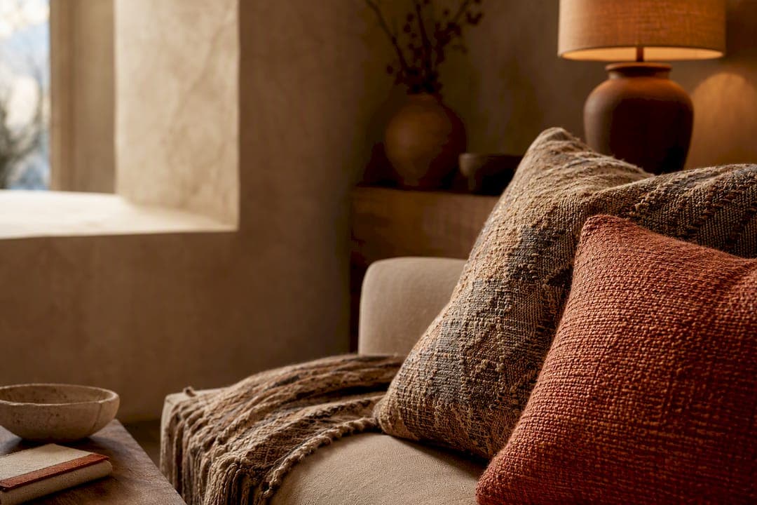
Yes, intense colored cushions are one of the easiest ways to add a deliberate, luxury-looking accent to any room. Pick one accent hue and one fabric texture, then order a single cushion or swatch to test how the color and scale actually behave in your space.
TL;DR:
- Bold cushions on neutral sofas work best with mustard, terracotta, cobalt, forest green, and passion red, especially when paired with matching metals and wood tones.
- Maintaining the 60/30/10 color rule and choosing textures before hues ensures cushions complement the room without overwhelming or clashing.
- Quality fabric choices like velvet or performance polyester, combined with properly sized inserts, significantly affect cushion longevity and vibrant appearance.
- For a balanced look, use two to five cushions of different sizes arranged with anchors at the ends and layered inward toward the center.
- Testing fabric swatches at different times of day and adjusting lighting can prevent color mismatches between online images and real-life decor.
Table of Contents
- Which Bold Colors Work Best With Your Sofa
- How Do You Use the 60/30/10 Rule With Cushions?
- Materials, Fills, and Quality Checks for Vivid Cushions
- How Many Cushions and What Sizes Should You Use?
- Where to Buy Vivid Cushions and What to Check First
- How to Maintain and Clean Cushions With Intense Colors
- Styling Bold Cushions Across Different Design Styles
- How Does Lighting Change the Way Cushion Colors Look?
- Create Decorus Perspective: Designing Bold Cushions With Purpose
- Where to Find Createdecorus Handcrafted Bold Cushions
- Sources
- FAQ
Which Bold Colors Work Best With Your Sofa
The color of your sofa decides almost everything about how bold you can go with cojines de colores intensos. Neutral furniture (beige, gray, ivory, white) acts like a blank canvas. Deep, saturated hues read as intentional and expensive against that backdrop instead of chaotic, because there's nothing else competing for attention.
Mustard, terracotta, cobalt, forest green, and passion red are the five workhorses of vibrant throw pillows on neutral sofas. Each one reads warm or cool in a slightly different way, so the choice usually comes down to the room's existing metals, wood tones, and light.
- Mustard and terracotta pair naturally with warm wood floors, brass fixtures, and earthy rugs. They lean autumnal without tipping into seasonal decor.
- Cobalt and jewel-toned blues cut through beige or gray sofas with a crisp, almost architectural contrast, especially in rooms with a lot of natural light.
- Forest green works as an unexpected neutral itself. It sits comfortably next to almost any other bold color without a fight.
- Passion red is the highest-commitment choice; it demands a room with minimal competing pattern, but on a plain sofa it becomes the single focal point.
If your sofa is already a bold color, the math flips. A cobalt or emerald sofa doesn't need another loud voice in the room. Designers generally steer toward muted or analogous tones here, tonal olive on a green sofa, dusty rose on a red one, so the cushions extend the sofa's mood instead of arguing with it. This is one of the most overlooked rules in colorful cushion designs: a bold base color plus another bold accent color usually reads as visual noise, not luxury.
A few combination recipes worth trying, depending on your starting point:
- Neutral sofa, cool room: cobalt plus a single mustard lumbar pillow. The blue does the heavy lifting; the mustard adds warmth without competing.
- Neutral sofa, warm room: terracotta paired with forest green in a two to one ratio. Both are saturated, but their earthy undertones keep them from clashing.
- Colored sofa (navy or teal): a muted coral or blush accent, plus one textured neutral cushion (raw linen or bouclé) to break up the color block.
- Colored sofa (deep green): a single mustard or burnt orange cushion against two tonal olive or moss pieces for depth without chaos.
The goal in every one of these pairings is the same: one hue does the work, and everything else supports it. Adding a vibrant accent through cushions is a low-cost way to experiment with mood and pattern before committing to anything more permanent, like paint or upholstery. If a combination doesn't work, you've lost a cushion, not a couch.
How Do You Use the 60/30/10 Rule With Cushions?
The 60/30/10 rule is the backbone of every well-composed room, and it's the reason bold cushion colors work when they're placed correctly and clash when they aren't. Sixty percent of a room's palette should be its dominant background, walls, large rugs, ceiling. Thirty percent goes to the main furnishings, your sofa or sectional. The remaining 10 percent belongs to accents: cushions, throws, art, and small objects.

Here's what most guides skip: color should be the last decision, not the first. A texture-first approach means choosing fabric and pile before hue. Velvet, bouclé, chunky knit, and tightly woven cotton all catch and reflect light differently, and that changes how a color is perceived before you even think about which shade to buy. A texture-first palette makes vivid dye read as rich and intentional rather than cheap or garish, because the eye registers depth and tactility before it registers "this is a very red pillow."
A practical, texture-first process looks like this:
- Choose your dominant texture first. Decide whether the room wants nap (velvet), weave (linen or cotton blend), or knit (chunky wool), based on the existing furniture's fabric.
- Pick a secondary texture that contrasts, not competes. Pair a smooth velvet with one nubby or woven piece so the grouping has depth.
- Layer in color last, using the 60/30/10 ratio as your ceiling. Let one cushion carry the boldest hue; everything else supports it in a muted or tonal version.
Three presets to build from:
- Neutral living room: a mustard velvet lumbar, a raw linen square in oatmeal, and a knit throw in rust. Texture varies more than color intensity, which keeps the look grounded.
- Navy sofa: a blush velvet square, a woven cream pillow, and one small cobalt accent for depth, never more than one truly bold hue against a colored base.
- Warm-toned room (terracotta walls, wood floors): a forest green velvet square, a jute-textured neutral, and a single burnt orange lumbar for punch.
Pro Tip: Order a fabric swatch or a single cushion before committing to a full set, and check it in your room at both morning and evening light. Colors shift more under artificial light than most people expect, and what looks perfect on a screen can read completely different by 8 p.m.
Materials, Fills, and Quality Checks for Vivid Cushions
Color intensity means nothing if the fabric looks cheap or the fill goes flat within a season. The cover fabric is your first quality signal. Velvet holds saturated dye exceptionally well and gives bold cushion colors a soft light-catching depth, though it needs occasional brushing to keep the nap uniform. Tightly woven cotton and linen blends are more breathable and forgiving with everyday use, but slightly duller in how they reflect intense hues. Performance polyester blends resist fading and stains, a real advantage for sunlit rooms or households with pets, though the color can look flatter up close compared to natural fibers.
- Velvet: richest color depth, needs gentle care, best for lower-traffic accent seating.
- Cotton and linen blends: durable, breathable, slightly less vibrant sheen, ideal for daily-use sofas.
- Performance poly: highest fade resistance, easiest to clean, less luxurious hand-feel.
Fill matters just as much as fabric. Interior designers consistently point to insert quality as the difference between a cushion that looks intentionally plush and one that looks deflated within weeks. The advice from design professionals interviewed by ElleDecor is to size the insert slightly larger than the cover, a down or down-blend insert in an 18-inch cover for a 16-inch cushion, for instance, so the fabric looks full rather than baggy. That extra loft is what makes a vividly colored cushion look expensive instead of just bright.
When you're shopping online, a handful of product-page details tell you almost everything about how a cushion will age:
- Fill percentage or material (down, down-blend, or polyester fiber), since higher down content generally holds shape longer.
- Care instructions, specifically whether the cover is machine washable, spot-clean only, or dry-clean recommended.
- Colorfastness or fade-resistance claims, especially for anything intended near a sunny window.
- Swatch availability, since screen colors rarely match fabric in hand.
A good insert and fill is arguably the single most underrated factor in whether a bold cushion looks like a design choice or an afterthought.
How Many Cushions and What Sizes Should You Use?

There's no rigid formula for cushion count, but sofa length gives you a reliable starting range. A loveseat or two-seater generally handles two to three cushions before it starts to feel crowded. A standard three-seater comfortably takes three to five. Anything longer, like a sectional, can support five to seven across multiple zones without looking excessive, as long as you're not blocking usable seating space.
Mixing sizes creates visual rhythm instead of a flat row of identical squares. A dependable combination is two 20 inch squares anchoring the back corners, paired with one 12 inch lumbar pillow layered in front for height variation. Practitioner guidance on arrangement generally favors placing the largest cushions at the sofa's ends first, then layering smaller ones toward the center or front, so the eye moves naturally across the seating rather than stopping at one cluster.
- Start with the anchors. Place your largest, boldest cushions at each end of the sofa.
- Layer inward with contrast. Add a mid-size textured piece angled slightly against the anchor cushions.
- Finish with a lumbar accent. A smaller rectangular cushion in front adds depth without overwhelming the seat.
A single, high-impact cushion works when you want one clean statement, a solid passion red square on an otherwise plain sofa, for example. Layered groups work better when you're building a fuller, more collected look, mixing colorful cushion designs with pattern and texture. Most rooms benefit from capping the palette at three or four distinct hues total; beyond that, even well-made cushions start to compete with each other instead of the room.
A short do and don't list worth keeping in mind:
- Do vary size and texture even when the colors stay bold.
- Do leave enough bare cushion space for someone to actually sit.
- Don't mix more than four intense hues in one grouping.
- Don't choose a flimsy, low-fiber insert just because the cover color caught your eye.
Where to Buy Vivid Cushions and What to Check First
Ready-made cushions win on speed and budget when you already know your exact color and size needs. Custom or handcrafted options make more sense when you want a specific hue that doesn't exist off the shelf, a unique texture combination, or a size that standard retailers don't stock. If you're outfitting a sectional with an unusual lumbar dimension, or matching a very particular terracotta to existing decor, custom work solves problems mass production can't.
Before buying anywhere online, run through a short checklist:
- Request a fabric swatch whenever the seller offers one; screen colors and printed photos shift depending on lighting and device settings.
- Check measurements against your actual cushion inserts, not just the marketed size, since cover dimensions and insert dimensions aren't always the same number.
- Look for realistic, well-lit photos, ideally showing the cushion in a room setting rather than only against a white background.
- Read the return policy, especially for color-sensitive purchases, since a hue that looked cobalt online can arrive closer to navy.
- Ask about shipping and lead times, particularly for handcrafted or made-to-order pieces, which naturally take longer than warehouse-stocked items.
Budget tiers roughly track what you're paying for. Entry-level covers, usually printed poly, deliver color and pattern at low cost but rarely hold up to years of daily use. Mid-range woven cotton or linen blends last longer and feel better, with moderate customization options. Handcrafted, artisan-made cushions sit at the top of the range, and that price typically reflects better materials, hand-finished construction, and the ability to request a specific color match rather than picking from a fixed catalog.
How to Maintain and Clean Cushions With Intense Colors
Vibrant dye fades fastest under direct, prolonged sun exposure, so the single easiest way to protect intense colored cushions is rotating them periodically, especially in a room with a south-facing window. Alternating which cushion sits closest to the light keeps any one piece from bearing the brunt of UV exposure.
Always check the care label before cleaning; velvet and down-filled cushions typically call for spot cleaning or professional care, while cotton and performance poly blends are more likely to be machine washable. Spot cleaning with a mild, color-safe detergent and a soft cloth is the safest default for saturated hues, since harsh stain removers or bleach-based products can strip dye unevenly and leave visible light patches.
For everyday upkeep, a quick vacuum on the upholstery setting or a gentle shake outdoors removes dust before it settles into the fibers and dulls the color's surface sheen. Fluffing and reshaping the insert regularly also keeps the cushion looking plump, which matters just as much for perceived color richness as the dye itself; a flattened cushion always looks duller than a full one, even in identical fabric.
Avoid drying colorful cushion covers in direct sunlight after washing. Air-dry in shade whenever possible, since heat and UV combined accelerate fading far more than either factor alone.
Styling Bold Cushions Across Different Design Styles
Bold cushion colors adapt to almost any interior style, but the supporting details change what "bold" actually looks like in practice.
Modern interiors favor clean lines and a restrained palette, so intense color works best in solid blocks rather than busy patterns, one cobalt or mustard square against a monochrome sofa does more than a printed set. Bohemian spaces invite layering: multiple bold hues, mixed patterns, and varied textures like woven macramé or embroidered detail can coexist, since the aesthetic itself embraces abundance. Minimalist rooms need the most restraint; a single richly colored cushion, in a quality fabric like velvet, becomes the room's one intentional flourish, and adding a second bold piece usually undercuts that effect. Traditional or transitional interiors tend to favor jewel tones, forest green, deep burgundy, sapphire, paired with classic shapes like piped edges or box cushions rather than modern silhouettes.
The common thread across every style is restraint in quantity paired with confidence in color. Bohemian rooms can absorb more hues at once, but even there, texture is doing as much work as color to keep the composition from feeling cluttered. Pairing cushions with rugs and other accents consistently, rather than treating each element in isolation, is what separates a styled room from a collection of individually nice objects.
How Does Lighting Change the Way Cushion Colors Look?
The same cushion can look like two different colors depending on when you check it, and that's not a flaw in the product. Warm incandescent or soft LED bulbs push colors toward orange and amber, which deepens reds, mustards, and terracottas but can mute cooler tones like cobalt or emerald. Cool daylight bulbs or north-facing natural light do the opposite, sharpening blues and greens while making warm hues look slightly washed out.
Direct sun exposure at midday tends to bleach out color intensity in photos and in person, while the same cushion under morning or evening light often reads richer and more saturated. This is exactly why a practical in-room test matters more than trusting a product photo: hold a swatch against your actual sofa at a few different times of day and see whether the color holds its character or shifts dramatically.
Rooms with mixed lighting, a combination of overhead fixtures, table lamps, and daylight, benefit from choosing cushion colors that read well under warm light specifically, since evening use is when most people actually notice their living room decor. If you're rethinking your lighting setup entirely, it's worth exploring current lighting trends alongside your cushion choices, since the two decisions genuinely affect each other more than most people realize.
Create Decorus Perspective: Designing Bold Cushions With Purpose
At Createdecorus, every cushion we make starts with texture, not color. Our artisans work from traditional Mexican techniques, hand-loomed weaves, embroidery passed down through generations, and build color intensity on top of that foundation rather than the other way around. It's why our handcrafted pieces tend to feel richer than mass-produced equivalents finished in the same shade.
Picture a neutral living room: oatmeal linen sofa, warm wood floor. We'd start with a hand-loomed terracotta lumbar for texture and warmth, add a tonal rust square for depth, and finish with one cobalt accent, small, deliberate, for contrast. Three pieces, one clear hierarchy, nothing competing for attention.
If you're building toward something similar, request a swatch first. Custom color work is also available for anyone chasing a very specific hue.
— Ernesto
Where to Find Createdecorus Handcrafted Bold Cushions
This brand offers handcrafted decorative pillows embracing a texture-first philosophy, featuring artisan textiles, custom color options, and premium fills designed to maintain shape over time. For those who haven't found the exact terracotta or cobalt shade in ready-made cushions, custom color options can address that need without settling for approximate matches.

Browse the current pillow collection to see fabric and color options in person, or request a swatch before committing to a full set. Interior designers and boutiques working on multiple projects can also look into trade pricing through the wholesale program for bulk or recurring orders. If a specific hue or texture combination isn't in the current catalog, reach out about custom work; that's where handcrafted production earns its price over mass-market alternatives.
Sources
- Cómo elegir cojines para decorar y renovar tu sala - Mi Revista
- Los interioristas confiesan sus secretos de decoración para colocar bien los cojines en casa | ElleDecor
FAQ
What Colors of Cushions Are Trending Right Now?
Mustard, terracotta, cobalt, forest green, and passion red remain the strongest performers for bold accent cushions on neutral sofas. Jewel tones like sapphire and emerald are also gaining ground in traditional and transitional interiors, especially paired with velvet or textured weaves.
What Cushion Color Works Best With a Beige Sofa?
Beige sofas handle almost any intense color well because there's minimal competing hue in the base. Terracotta, cobalt, mustard, and forest green all read as intentional and rich against beige, especially when paired with a textured fabric like velvet or woven cotton.
Where Can I Find Affordable, Attractive Cushions?
Ready-made cushions from mainstream retailers offer the lowest cost and fastest delivery, though color accuracy and durability vary by fabric quality. For a specific hue, better fill, or a handcrafted look, browsing a dedicated pillow collection with swatch options usually delivers a more reliable color match than a generic search.
What Size Cushions Should I Get for My Sofa?
A loveseat generally handles two to three cushions, a standard three-seater fits three to five, and larger sectionals can take five to seven across multiple zones. Mixing sizes, like two 20 inch squares with one 12 inch lumbar, creates more visual depth than uniform squares alone.