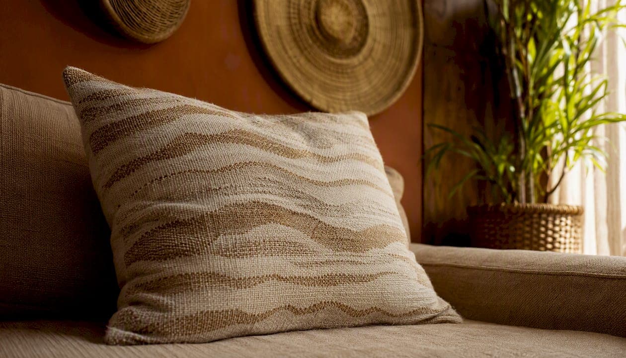
Yes — bold patterns absolutely work in a neutral room when you control scale, repeat a linking hue, and give each pattern room to breathe. The role of bold patterns in neutral rooms is not to compete with the quiet palette around them but to add visual weight, rhythm, and perceived texture that a flat neutral scheme simply cannot generate on its own. Start here, before you read another word:
- Swap in two patterned throw pillows in a tone that already exists somewhere in the room — a warm sand, a soft terracotta, or a dusty sage.
- Place a tonal patterned rug under your main seating. A hand-loomed piece with a low-contrast geometric or organic motif grounds the space and supplies a palette you can repeat above.
- Try a small patterned lampshade or a framed textile swatch on a side table or gallery wall — a reversible, low-cost test that shows you how a motif reads under your specific light.
The rules that govern all three moves — scale, repetition, anchor, and negative space — are what the rest of this guide unpacks.
Key Takeaways
| Point | Details |
|---|---|
| Start with pillows or a rug | Both are reversible, high-impact, and supply a palette the rest of the room can echo. |
| Repeat one linking color | Carry a single hue from your hero pattern into at least two other places to make the scheme feel intentional. |
| Apply the 70/20/10 rule | Keep 70% of surfaces neutral, 20% in your secondary tone, and 10% in your boldest accent pattern. |
| Preserve negative space | At least one large surface should stay solid; unmanaged visual load produces cognitive strain. |
| Createdecorus for artisan pattern | Hand-loomed Mexican pieces introduce pattern as texture and cultural warmth, available retail and wholesale. |
Table of Contents
- Why do bold patterns change the feel of a neutral room?
- What role should pattern play in your room: accent, anchor, or drench?
- What rules and proportions keep bold patterns under control?
- How do you choose patterns that read as neutrals?
- Where should you place bold patterns for the most impact?
- How do you mix two or three patterns without chaos?
- Pattern drenching: how do you do maximalism without chaos?
- What are the lowest-risk ways to experiment with pattern?
- How do Mexican handcrafted accents from Createdecorus introduce pattern and texture?
- What mistakes should you avoid when adding bold patterns?
- How do Mexican design traditions shape pattern preferences?
- How does lighting in Mexican homes affect bold patterns?
- How do natural materials and colors in Mexican decor work alongside bold patterns?
- Why handcrafted accents matter in a neutral room
- Createdecorus: handcrafted pattern that belongs in your neutral room
- Sources
Why do bold patterns change the feel of a neutral room?
A neutral room without pattern tends to feel calm but also flat. Pattern corrects that by introducing visual weight: the eye has something to travel to, pause on, and return from. That movement creates rhythm, and rhythm is what makes a room feel alive rather than staged.
Micro-patterns and textural motifs do something particularly useful. From across a room, a nubby linen weave, a tone-on-tone jacquard, or a subtle geometric in two shades of cream reads almost as a solid. Up close, it reveals complexity. Designers report that subtle, tone-on-tone patterns and textural motifs "read" as neutrals and add depth without overwhelming a neutral scheme, which means you can introduce genuine pattern interest while keeping the room's overall calm intact.
Pattern also functions as a third material alongside color and texture. A hand-loomed pillow with a low-contrast botanical print contributes warmth the way a wood grain or a linen drape does — through tactility and visual complexity rather than through color contrast alone.
What role should pattern play in your room: accent, anchor, or drench?
Before you buy anything, decide how much of the room pattern will occupy. Three distinct roles exist, and each carries a different commitment level.
| Role | What it means | Visual impact | Commitment | Best rooms |
|---|---|---|---|---|
| Accent | One or two patterned items (pillows, a lampshade, framed art) | Subtle, adds interest | Low — fully reversible | Any room, especially rentals |
| Anchor | One large patterned surface (rug, feature wall, upholstered sofa) | Medium-high, defines the room | Medium — requires planning | Living rooms, dining rooms |
| Drench | Pattern across multiple surfaces with a shared palette | High, immersive | High — structural changes possible | Bedrooms, studies, bold living rooms |
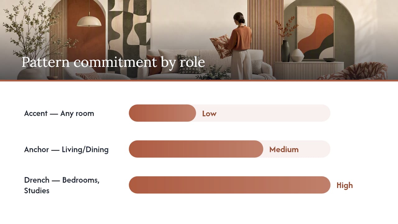
Most homeowners who love neutral rooms are most comfortable starting at the accent level and moving toward anchor once they see how a single rug or statement textile changes the space. The drench approach works beautifully but demands more discipline — a shared palette and varied scales are non-negotiable.
Pro Tip: Move from accent to anchor to drench in stages. Introduce patterned pillows first. If the room still feels right after two weeks, add a patterned rug. Only after both feel settled should you consider a wallpapered feature wall or a patterned upholstered piece.
What rules and proportions keep bold patterns under control?
Three heuristics have proven reliable across room types, and applying even one of them prevents the most common patterning mistakes.
-
The 3-5-7 pattern rule. Use patterns in odd numbers — one hero pattern, one supporting pattern, one filler texture. An even number of competing patterns tends to feel balanced in a way that reads as static rather than dynamic. Three patterns at different scales almost always feel more curated than two at similar sizes.
-
The 70/20/10 color balance. Seventy percent of the room's surfaces carry the dominant neutral (walls, large upholstery, flooring). Twenty percent carry a secondary tone — often where your anchor pattern lives. Ten percent is the accent, where the boldest or most saturated motif appears. This proportion prevents any single pattern from overwhelming the room's quiet base.
-
The 15% breathing-space rule. No more than roughly 15% of any wall or floor surface should be covered by a high-contrast pattern. The remaining area needs to be solid or near-solid so the eye has places to rest. Research indicates unmanaged visual load from busy surfaces can create cognitive strain; preserving negative space and clear anchors prevents visual anxiety.
How these rules apply by room type:
| Rule | What to measure | Living room | Bedroom | Dining room |
|---|---|---|---|---|
| 3-5-7 | Number of distinct patterns | 3 patterns max | 2–3 patterns | 2 patterns |
| 70/20/10 | Color surface area | Neutral walls + sofa; patterned rug; accent pillows | Neutral walls + bedding; patterned throw; accent cushions | Neutral walls + table; patterned runner; accent napkins |
| 15% breathing space | High-contrast pattern coverage | Leave large wall sections solid | Keep ceiling and two walls clear | Keep floor and two walls clear |
Edit down by removing the pattern that contributes least to the palette link. If two patterns share no color, one of them does not belong.
How do you choose patterns that read as neutrals?
The selection criteria come down to contrast and tactility. A pattern with low contrast between its two tones — think cream on ivory, warm sand on beige, or charcoal on slate — reads as a neutral from a normal viewing distance. The motif is there, but it does not shout.
Emily Henderson recommends "quiet pattern" — texture, micro repeats, and tone-on-tone prints — as the safest first step for enlivening neutral rooms. Pinstripes, subtle plaids, and textured weaves all qualify. So do grasscloth wallcoverings, nubby linen upholstery, and hand-loomed rugs with organic geometric motifs in natural dyes.
Scale and viewing distance interact in a useful way. A large-scale botanical in two shades of warm white reads as texture from across a room but reveals its full motif up close. A small-scale geometric in high contrast (black on white) reads as pattern from any distance. When you want pattern that behaves like a neutral, choose large-scale motifs in low contrast or small-scale motifs in any contrast — both strategies reduce the visual "loudness" of the print.
Material choices reinforce this effect. Silk-linen tonal prints, hand-loomed cotton geometrics, and embossed velvet all carry pattern through texture rather than color contrast. In drapery, a woven stripe in two warm neutrals adds rhythm to a window without competing with the room's palette.
Pro Tip: Always test a sample in your actual room before committing. Pin the fabric or wallpaper swatch to the wall and observe it under morning light, afternoon sun, and your evening artificial light. Mexican homes often receive intense direct sunlight that can bleach low-contrast patterns or intensify high-contrast ones — what looks balanced in a showroom may read very differently at home.
Where should you place bold patterns for the most impact?
Location determines both the visual impact of a pattern and how easy it is to reverse if the result does not feel right. Ranked from highest impact to most reversible:
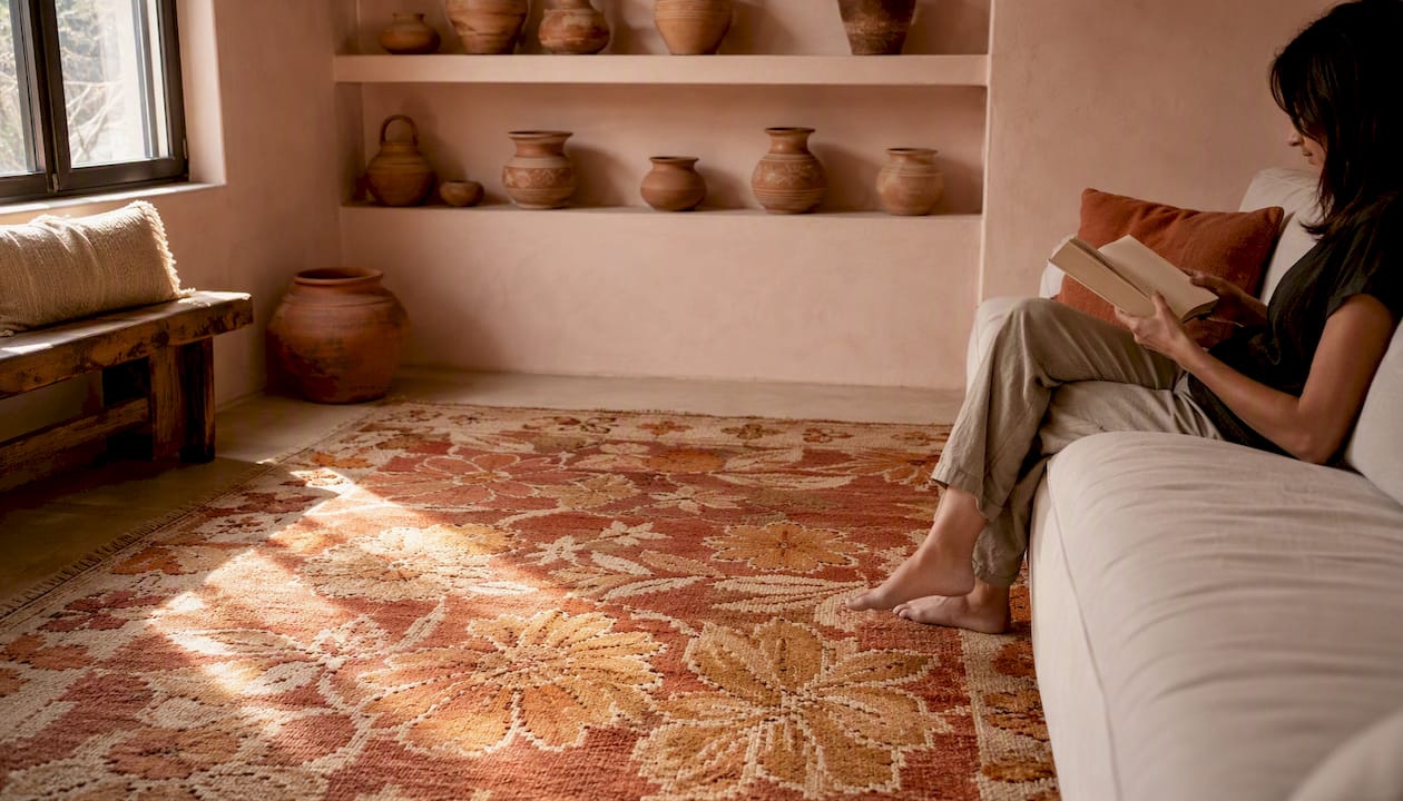
Rugs sit at the intersection of high impact and high reversibility. A patterned rug grounds the entire seating arrangement, supplies a palette the rest of the room can echo, and can be rolled up and replaced without touching a wall or a piece of furniture. Rugs are an effective, reversible anchor for introducing pattern and establishing a repeatable palette in neutral rooms. For a small apartment, a single bold rug under a coffee table is often enough to make the room feel complete.
Curtains cover large vertical surfaces and shift the room's perceived height and warmth. A patterned linen drape in a tone close to the wall color adds rhythm without visual disruption. They are moderately reversible — changing curtains takes an afternoon.
Upholstery on a sofa or armchair is higher commitment but delivers sustained impact. A patterned accent chair in a neutral room functions as a focal point without requiring any structural change. Pair it with solid upholstery on the main sofa to keep the 70/20/10 balance intact.
Wallpaper on a feature wall is the step up in commitment. One papered wall in a bedroom or dining room can carry the room's entire pattern story, freeing every other surface to stay solid. For large living rooms, a papered alcove or chimney breast works the same way.
Pillows, lampshades, and artwork are the lowest-commitment entry points. A decorative pillow with a hand-loomed geometric or botanical motif introduces pattern at eye level when seated — exactly where it registers most. A patterned lampshade casts patterned light, adding a secondary layer of interest after dark.
For a small apartment, concentrate pattern at one level: floor (rug) or eye level (pillows and art), never both at full intensity simultaneously. Large living rooms can carry pattern at multiple levels because the greater volume of negative space between surfaces prevents visual crowding. You can also consider how interior door finishes contribute to the room's overall pattern rhythm — a paneled or textured door reads as a subtle repeating motif that supports rather than competes with textile patterns.
How do you mix two or three patterns without chaos?
Mixing patterns is where most homeowners hesitate, and the hesitation is understandable. The method below removes the guesswork.
-
Choose your hero pattern first. This is the largest, most visually complex motif in the room — often the rug or a patterned upholstered piece. It sets the palette and the scale reference for everything that follows. Every other pattern must contain at least one color from the hero.
-
Add a supporting pattern at a different scale. If the hero is a large-scale organic botanical, the supporting pattern should be a medium-scale geometric or a stripe. The scale contrast is what prevents the two from competing. They share a color but occupy different visual frequencies.
-
Introduce a neutral-texture filler. A nubby weave, a tonal jacquard, or a subtle linen texture completes the trio without adding a third distinct motif. It reads as a solid from a distance but adds tactile complexity up close. This is the pattern that makes the room feel layered rather than decorated.
The linking color is the most important device in this sequence. Repeat it in at least three places — the rug, a pillow, and a small accessory — and the eye reads the room as intentional rather than assembled. A practical example: a warm sand geometric rug (hero) paired with a terracotta stripe pillow (supporting) and a nubby cream-linen throw (filler). The terracotta appears in the rug's border, the pillow's body, and a ceramic vase on the shelf. Three appearances of one color tie three different patterns into a single, coherent scheme.
For detailed guidance on layering handcrafted pillows across different scales and motifs, Createdecorus has a practical styling resource that walks through this process room by room.
Pattern drenching: how do you do maximalism without chaos?
Pattern drenching means covering multiple surfaces — walls, floor, upholstery, textiles — with different prints that share a common thread. Done well, it feels immersive and intentional. Done carelessly, it produces visual noise that exhausts the people living in it.
The control levers are three: a consistent palette, deliberate scale variation, and solid anchors. Pattern drenching can work when anchored by a cohesive palette, varied pattern scales, and solid areas that give the eye a rest. Remove any one of those three and the scheme tips into clutter.
A practical drenching scheme for a bedroom: a hand-loomed geometric wallpaper in warm terracotta and cream (hero), a tonal botanical duvet in cream and sage (supporting), a nubby linen throw in solid terracotta (anchor), and a small-scale stripe pillow in cream and terracotta (filler). The walls, bedding, and textiles all carry pattern, but the solid terracotta throw gives the eye a place to rest, and every piece shares the terracotta-cream axis.
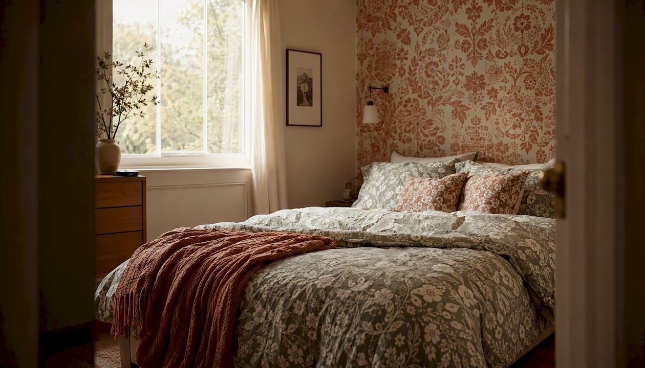
Before you commit to a drenched room, run through this editing checklist: Does every pattern share at least one color with the hero? Is there at least one solid surface or anchor piece? Do the patterns span at least two different scales? Is there enough negative space on walls and floor that the room does not feel papered floor to ceiling? If any answer is no, remove the pattern that breaks the rule rather than adjusting everything else around it.
What are the lowest-risk ways to experiment with pattern?
Hesitant homeowners have more options than they often realize. The most reversible experiments cost very little and take less than an hour to set up.
- Throw pillows are the fastest test. Two patterned pillows on a neutral sofa change the room's character immediately and can be swapped back the same afternoon. Styling throw pillows like a designer involves mixing one patterned and one textured pillow at slightly different scales rather than matching pairs.
- Removable wallpaper samples let you tile a section of wall and live with a motif for a week before committing to full installation. Several Mexican suppliers offer sample panels for exactly this purpose.
- Area rugs are the highest-impact reversible experiment. Roll one out, live with it for two weeks, and assess. If the palette feels off, the rug goes back; the walls and furniture are untouched.
- Lampshades are underused pattern vehicles. A patterned shade on a table lamp changes the quality of evening light in a room and costs far less than reupholstering anything.
- Framed textile swatches function as artwork and let you audition a fabric's motif and color on the wall before committing to curtains or upholstery in the same material.
When auditioning any pattern, photograph the room at three moments: morning natural light, afternoon direct sun, and evening with lamps on. Mexican homes often receive strong southern or western light that shifts warm tones dramatically between morning and evening. A pattern that reads as a quiet sand at noon may glow amber at 6 PM — which can be beautiful, but you want to see it before you commit.
For cleaning and care: most artisan-woven textiles in Mexico are best spot-cleaned with a damp cloth and mild soap. Avoid machine washing hand-loomed pieces, as the natural dyes and hand-knotted structures are sensitive to agitation. Air dry flat, away from direct sun, to preserve both color and weave integrity.
How do Mexican handcrafted accents from Createdecorus introduce pattern and texture?
Three styling recipes show how Createdecorus pieces work as practical pattern tools in a neutral room.
-
Tonal rug plus patterned pillows. A hand-loomed rug in warm sand and cream with a low-contrast geometric motif anchors the seating area and supplies the room's palette. Two Createdecorus pillows in a medium-scale botanical print — pulling the rug's warm sand into their background — sit on a neutral linen sofa. The rug reads as texture from across the room; the pillows introduce the motif at eye level. The result is layered without being loud. For a direct comparison of how rugs and pillows function as pattern anchors, Createdecorus's styling guide covers the trade-offs in detail.
-
Patterned ottoman as anchor. A Createdecorus ottoman in a hand-loomed geometric textile — terracotta, cream, and warm brown — placed at the center of a neutral living room becomes the room's focal point without requiring any wall treatment. Its artisan weave, produced using traditional Mexican techniques, carries pattern through texture as much as through color. Surround it with solid upholstery and a neutral rug, and the ottoman does all the work.
-
Layered pillows mixing micro and medium-scale motifs. Three Createdecorus pillows in different scales — a small-scale stripe, a medium-scale geometric, and a nubby tonal texture — arranged on a neutral bed or sofa demonstrate the 3-5-7 principle in miniature. The stripe and geometric share a terracotta thread; the textured pillow reads as a near-solid. Natural dyes and hand-loomed construction mean the patterns carry the warmth of artisan craft rather than the flatness of machine printing.
Createdecorus pieces are available for retail purchase and through wholesale accounts for interior designers and boutiques across Mexico. Custom orders are also available for clients who want a specific palette or scale matched to an existing room.
What mistakes should you avoid when adding bold patterns?
- Too many competing scales. Three patterns at the same scale fight each other. Fix it by removing the middle-scale pattern and keeping one large and one small, with a textured filler.
- No color link between patterns. If two patterns share no color, the room reads as accidental. Fix it by repeating one hue from the dominant pattern in at least two other places — a pillow, a vase, a throw.
- Ignoring negative space. A room where every surface carries pattern produces cognitive strain. Fix it by designating at least one large surface — a wall, the main sofa, the floor — as a solid anchor.
- Poor lighting. A bold pattern in a dim corner disappears; the same pattern under a harsh spotlight flattens. Fix it by positioning patterned pieces where they receive diffused natural light or warm ambient light from a nearby lamp.
- Mismatched finishes. A matte hand-loomed textile next to a high-gloss printed cushion creates a finish clash that undermines both. Fix it by keeping textile finishes within one register — matte with matte, or a deliberate contrast of matte and subtle sheen, never matte and high-gloss together.
For maintenance in Mexican homes: sun exposure is the primary threat to patterned textiles. Position patterned rugs and upholstery away from windows that receive direct afternoon sun, or use UV-filtering window film. Artisan-dyed pieces are particularly sensitive — natural dyes fade more gracefully than synthetic ones, but they do fade. Rotate rugs seasonally and store spare textiles folded in breathable cotton bags away from direct light.
How do Mexican design traditions shape pattern preferences?
Mexican interior design carries one of the richest pattern traditions in the world, drawing from pre-Columbian geometric motifs, colonial tile work, and the vivid textile traditions of communities across Oaxaca, Chiapas, and Puebla. These are not decorative references — they are living craft traditions, and they shape what patterns feel culturally resonant in a Mexican home.
Geometric patterns with strong angular structure — step frets, diamond lattices, and interlocking chevrons — appear across Zapotec weaving, Talavera tile, and Otomí embroidery. These motifs carry cultural weight that purely imported Scandinavian or mid-century patterns do not. In a neutral room, a hand-woven Zapotec-inspired rug or an Otomí-embroidered pillow introduces pattern that feels rooted rather than applied.
Color preferences in Mexican design traditions tend toward warmth: terracotta, deep indigo, warm ochre, and the earthy reds of natural cochineal dye. These tones integrate naturally with neutral bases of warm white, sand, and adobe. A neutral room built on warm whites and natural plaster tones accepts Mexican-tradition patterns more gracefully than a cool gray or blue-white neutral scheme, which can make warm-toned motifs feel displaced.
The artisan craft context also matters practically. Hand-loomed textiles carry slight irregularities in weave and dye that machine-printed fabrics do not. Those irregularities are not flaws — they are the signature of handcraft, and they give the pattern a tactile depth that reads as warmth rather than decoration. Choosing pieces made by Mexican artisans, whether directly or through brands like Createdecorus that work within that tradition, connects the room to a living cultural practice.
How does lighting in Mexican homes affect bold patterns?
Light in Mexico is not a neutral variable. Most Mexican homes — particularly in central and southern regions — receive intense, warm-toned natural light for much of the year. That light interacts with pattern in ways that are worth understanding before you commit to a motif.
Warm natural light amplifies warm-toned patterns. A terracotta geometric that looks balanced under the diffused northern light of a European showroom will intensify in a south-facing Mexican room at midday. This is not necessarily a problem — it can be beautiful — but it means you should audition patterns under your home's actual light conditions before purchasing.
High-contrast patterns (black on white, deep indigo on cream) tend to hold their character across different light conditions. Low-contrast tone-on-tone patterns are more sensitive: a cream-on-sand geometric may nearly disappear in a dim interior or under warm incandescent light, while the same pattern under bright natural light reads clearly. If your room relies on artificial light in the evenings, test your pattern samples under your actual lamps, not just in daylight.
Patterned textiles near windows in Mexican homes also face the sun-fading issue mentioned earlier. Natural-dye pieces fade toward warmer, more muted tones over time — which can actually deepen their integration with a neutral scheme, but only if the original palette was warm to begin with. A cool-toned pattern will fade toward an unexpected warm tone that may no longer link to the room's palette.
How do natural materials and colors in Mexican decor work alongside bold patterns?
The materials most common in Mexican interior design — adobe, cantera stone, hand-plastered walls, clay tile, natural wood, and woven palm — are themselves pattern-rich surfaces. A hand-plastered wall carries a subtle texture that reads as a low-contrast pattern. A clay tile floor has a grid and a surface variation that functions as a repeating motif. These existing material patterns are the neutral base that bold textile patterns must work with, not against.
The practical implication: in a room with a clay tile floor and hand-plastered walls, you already have two low-contrast patterns in play before you add a single textile. Apply the 3-5-7 rule from that starting point. Your rug becomes the supporting pattern, your pillows the accent, and the room's architectural surfaces count as the filler texture. This is why a single bold rug in a traditional Mexican interior can feel like enough — the room's materials are already doing quiet pattern work.
Natural colors in Mexican decor — warm whites, adobe, terracotta, sand, warm wood tones, and the deep greens of tropical plants — form a palette that accepts warm-toned bold patterns with ease. A deep indigo geometric pillow on a warm white sofa in a room with clay tile floors and a wooden beam ceiling works because the indigo is the only cool element in an otherwise warm composition. It reads as bold without disrupting the room's warmth. Introducing door colors and finishes that align with this warm palette reinforces the room's cohesion and prevents the architectural elements from competing with your textile patterns.
Natural materials also provide the solid anchors that pattern-drenched rooms need. A cantera stone fireplace surround, a raw wood dining table, or a woven palm ceiling are visually complex but tonally neutral — they absorb the eye's attention without competing with a patterned textile. Use them deliberately as the solid resting points in a scheme that carries pattern elsewhere.
Why handcrafted accents matter in a neutral room
We believe the most enduring rooms are not the ones with the most pattern, but the ones where every piece carries a reason for being there. At Createdecorus, we work with Mexican artisans whose techniques — hand-looming, natural dyeing, hand-knotting — produce textiles that carry pattern as texture and cultural memory rather than as surface decoration. A hand-loomed pillow with a Zapotec-inspired geometric is not simply a patterned object. It is a dialogue between artisan heritage and contemporary design, and that depth is what gives a neutral room its soul.
Our collection of handcrafted pillows, ottomans, and home accents is made to integrate with neutral rooms precisely because the patterns are built from the room's own material language — natural fibers, warm dyes, and weave structures that add tactile complexity without demanding attention. For homeowners who want to go further, our styling guides on luxury textiles offer deeper guidance on material choices and placement.
Createdecorus: handcrafted pattern that belongs in your neutral room
The advice in this guide points toward one consistent conclusion: the patterns that work best in neutral rooms are the ones that carry depth through craft rather than loudness through contrast. Createdecorus handcrafted pillows, ottomans, and accents — all produced in Mexico — are built on exactly that principle. Each piece uses artisan weaves, natural dyes, and hand-loomed construction to introduce pattern as warmth and texture, not visual noise.

Whether you are starting with two accent pillows or anchoring a room with a patterned ottoman, Createdecorus offers retail pieces and wholesale trade accounts for interior designers and boutiques across Mexico. Custom palette and scale options are available for clients with specific room requirements. Browse the full collection and find the piece that belongs in your room at Createdecorus.
Sources
- Patterns Are the New Neutrals: 6 Designer Tips for Decorating With "Timeless" Prints in 2026
- This Is The Quick Fix For Your Boring Neutral Room - Emily Henderson
- More is more: Mastering the art of pattern drenching | The Independent
- Looks good, feels bad: Stirling-led review explains why modern design can strain your brain
- 30 Bold Living Rooms That Mix and Match Patterns