
Design differentiation through accents is the practice of using discrete visual or material details to create distinctiveness without redesigning an entire system. A single accent color on a call-to-action button makes a UI feel purposeful and guides the eye. A hand-loomed textile pillow in terracotta against a neutral sofa signals warmth and artisan heritage at a glance. A sculptural brass lamp in an otherwise spare room becomes the room's entire personality. In each case, the accent does the heavy lifting: it establishes visual hierarchy, signals the intended audience, and raises perceived value, all without touching the underlying structure.
Key Takeaways
Design differentiation through accents works because discrete, well-governed details change perception, signal audience fit, and raise willingness-to-pay without requiring a full system redesign.
| Point | Details |
|---|---|
| Accents change perception first | A single material, color, or motion detail shifts how a product is perceived before a viewer can articulate why. |
| Audience fit is the critical variable | Specialized accents raise price ceilings for segments that value them; the same accents can alienate segments that do not. |
| Governance prevents drift | Accent tokens and design dialects keep accents consistent across teams and touchpoints without freezing the system. |
| Accessibility is non-negotiable | Color contrast, motion reduction, and cultural review must be built into the accent specification, not added afterward. |
| Createdecorus as a reference | Createdecorus demonstrates material-driven accent differentiation through artisan textiles, cultural provenance, and deliberate color and texture choices. |
Table of Contents
- Why accents are strategic tools, not just decoration
- What types of accents do designers actually use?
- Core principles that govern effective accent use
- How to choose and test accents with a practical workflow
- What research says about accents and willingness-to-pay
- Real-world examples of accent-driven differentiation
- Common mistakes and accessibility checks for accent use
- A 7-step checklist for implementing accent-driven differentiation
- When accents are enough, and when they are not
- Createdecorus: handcrafted accents with a distinct point of view
- Sources
Why accents are strategic tools, not just decoration
Accents change perception before a viewer can articulate why. That shift in perception carries real business weight. A well-placed accent color on a primary CTA can improve discoverability by drawing the eye to exactly one action, reducing cognitive load and increasing click-through. In physical products, a contrasting trim or a distinctive material finish signals quality and intentionality in a way that uniform surfaces rarely do.
The importance of design differentiation goes beyond aesthetics. Accents let teams refresh a product's market position without the cost and risk of a full rearchitecture. They are low-commitment, high-signal interventions. Research on status goods found that consumers tend to prefer high-end products to look more differentiated while preferring low-end products to be less so, creating asymmetric strategic trade-offs for brands managing product families across price tiers.
Key benefits designers and brand teams gain from accent-driven differentiation:
- Visual hierarchy: Accents direct attention to the most important element, reducing the work a viewer must do to understand a composition.
- Brand signaling: A consistent accent (a color, a material, a finish) becomes a recognition cue that audiences associate with a specific brand or product tier.
- Reduced redesign cost: Swapping or refining an accent token costs a fraction of a full system overhaul.
- Usability lift: In UI, a single accent color on interactive elements reduces ambiguity about what is tappable or clickable.
- Perceived value increase: Specialized accents can raise willingness-to-pay among the consumer segments that value those aesthetic cues.
Research signal: A design-research study found that differentiated products had higher price ceilings among segments that valued the specialized aesthetics, though effects varied across product samples and audience groups among segments that valued the specialized aesthetics, though effects varied by product and audience.
What types of accents do designers actually use?
Accents appear across every design discipline, and the right type depends on medium, audience, and intent. Here is a working taxonomy, organized by discipline, with the primary risk to watch for each.
Product design
- Material accent: A matte ceramic body with a glossy colored glaze band. Usage: signals craft and tier. Risk: inconsistent application across a product line dilutes the signal.
- Finish accent: Brushed brass hardware on a powder-coated steel frame. Usage: communicates premium positioning. Risk: finish mismatch across touchpoints reads as careless.
- Scale accent: An oversized knob or handle that breaks proportion deliberately. Usage: creates memorability. Risk: can compromise ergonomics if scale is chosen for aesthetics alone.
Furniture and interiors
- Upholstery accent: A contrasting pillow or throw in a bold color or texture against a neutral base. Usage: easy to update, creates focal points. Risk: overuse flattens the hierarchy.
- Trim accent: Contrasting piping, fringe, or edge detail on upholstered furniture. Usage: signals handcraft and attention to detail. Risk: period-specific details can date a piece quickly.
- Architectural accent: Interior doors treated as focal points through color or material. Usage: creates visual anchors in a room without structural change. Risk: a door accent that clashes with the floor or ceiling reads as an afterthought.
UI and digital product
- Accent color: A single hue applied to interactive elements (buttons, links, active states). Usage: guides action. Risk: using the accent color for decorative elements dilutes its functional meaning.
- Microinteraction: A subtle animation on a form field focus state. Usage: confirms system response and adds delight. Risk: excessive motion creates distraction or accessibility issues.
- Motion accent: A scroll-triggered reveal or a loading animation that carries brand character. Usage: reinforces personality. Risk: violates
prefers-reduced-motionif not handled correctly.
Branding and packaging
- Typography accent: A single display typeface used only for headlines, contrasting with a utilitarian body font. Usage: creates voice and hierarchy. Risk: overuse of the display face reduces its impact.
- Foil or texture accent: Spot UV or embossed detail on packaging. Usage: signals premium tier at point of sale. Risk: adds cost and can feel gratuitous without a clear rationale.
- Pattern accent: A signature print used on lining, endpapers, or secondary surfaces. Usage: rewards close inspection and builds brand depth. Risk: pattern complexity can conflict with primary messaging.
Sound and tactile accents
- Sound accent: A distinctive notification tone or UI sound that carries brand character. Usage: builds recognition in audio-first contexts. Risk: intrusive in shared or quiet environments.
- Tactile accent: A soft-touch coating, a debossed logo, or a weighted closure. Usage: elevates perceived quality at the moment of handling. Risk: tactile details are invisible in digital channels and must be communicated through photography and copy.
Core principles that govern effective accent use
Accents work when they are governed, not improvised. These principles apply whether you are designing a UI component library or specifying materials for a handcrafted pillow.
- Contrast with restraint: An accent only works because it is different from its surroundings. One strong accent per composition is usually enough. Two accents competing for attention cancel each other out.
- Coherence and harmony: The accent must feel like it belongs to the same design language, even as it departs from the base. A terracotta pillow on a warm-toned sofa feels intentional; the same pillow on a cool gray sectional may feel arbitrary without other warm elements to connect them.
- Consistency for recognition: Repeating the same accent across touchpoints builds a recognition cue. Accent color tokens with defined shades and pairing rules let teams apply accents reliably across backgrounds, text, borders, and icons without drifting.
- Audience fit: Accents are most effective when they target a clearly defined segment. A consumer who values artisan heritage responds to hand-loomed texture; one who values minimalism may read the same texture as clutter. Differentiation is not universal.
- Governed variation: Design systems benefit from treating accents as governed exceptions, not ad-hoc deviations. Design dialects let teams permit controlled local variation within a system, preserving coherence while enabling necessary expression.
Pro Tip: When choosing contrast level, test your accent at three saturation steps above your base tone, at full saturation, and at a tint. The step that reads clearly at arm's length in ambient light is usually the right one. For digital surfaces, WCAG 3:1 contrast ratio is the floor for non-text UI elements.
The linguistic concept of accent variation offers a useful parallel here. Just as regional accents in speech signal identity and belonging without breaking the rules of a shared language, visual accents signal a product's character without abandoning the design system that holds everything together.
How to choose and test accents with a practical workflow
Moving from an accent idea to a validated decision takes a structured process. Here is a workflow that works for both digital and physical design contexts.
- Define audience fit first. Before generating options, write one sentence describing the segment you want to signal to. What do they value? What materials, colors, or interactions carry meaning for them? This sentence becomes your filter for every option you generate.
- Generate a shortlist. Collect mood boards, material samples, color swatches, or token sketches. Aim for three to five distinct directions, not variations on one idea. Diversity at this stage makes the eventual choice defensible.
- Prototype in context. A swatch on a white card tells you almost nothing. Render the accent in its actual environment: a mock-up of the UI screen, a physical sample on the furniture piece, or a room render with the pillow in place. Context reveals whether the accent reads as intended or disappears.
- Run qualitative validation. Show the prototype to five to eight people from your target segment. Ask what they notice first, what the accent communicates, and whether it changes their sense of the product's quality or price. Listen for surprises.
- Run quantitative testing where possible. For digital accents, an A/B test measuring click-through rate, task completion, or time-on-task gives you a behavioral signal. For physical products, a price-estimation exercise or a conjoint survey can reveal willingness-to-pay differences between accent variants.
- Track the right metrics. Behavioral metrics: click-through rate, conversion rate, task completion. Perceptual metrics: perceived quality score, brand fit rating, price estimation. Both matter. A beautiful accent that does not move behavior is decoration; a behavior-moving accent that feels off-brand is a short-term fix.
- Iterate before specifying. One round of testing rarely settles the question. Plan for at least two prototype iterations before writing a production specification. For physical products, budget for material samples and small-run prototypes. For digital, Figma or Framer prototypes cost almost nothing to revise.
What research says about accents and willingness-to-pay
The business case for accent-driven differentiation has empirical backing. A design-research study on product pricing found that differentiated products had higher price ceilings among segments that valued the specialized aesthetics, though effects varied across product samples and audience groups among the consumer segments that valued the specialized aesthetics, though effects varied across product samples and audience groups. The implication is clear: accents are not universally valuable, but for the right segment, they can act as a durable competitive barrier by embedding cultural, artisanal, or material signals that low-cost competitors struggle to replicate.
A separate empirical analysis of status goods across multiple years of market data found that some consumers prefer high-end products to look more differentiated while others prefer low-end products to be less so. This asymmetry has direct implications for product families.
Strategic signal: Specialized design accents can raise price ceilings for the segments that value them, but the same accents may alienate segments that do not, making audience targeting the critical variable.
Practical implications for product and brand teams:
- Unify when recognition matters most. If your brand competes on familiarity and accessibility, a consistent, restrained accent across all tiers builds recognition without alienating price-sensitive buyers.
- Diversify when premium protection matters. If you manage a product family with distinct tiers, stronger accents on high-end variants signal exclusivity and justify price separation.
- Test before committing. Because accent effects vary by segment, qualitative research with your specific audience is more reliable than applying findings from a different category.
- Treat accents as a margin lever. For artisan and craft-positioned products, material and texture accents can protect margins in niche markets where low-cost replication is difficult.
Real-world examples of accent-driven differentiation
UI example: accent color on a primary action. A SaaS dashboard using a neutral gray palette introduced a single warm amber as its sole accent color, applied only to primary buttons and active navigation states. The change required no structural redesign. Task completion rates in user testing improved because users could identify the primary action without scanning the full screen. The amber also became a brand recognition cue across marketing materials, creating coherence between product and campaign.
Product example: material finish as a tier signal. A consumer electronics brand differentiated its premium headphone line from its entry-level line through a single material change: a soft-touch matte coating on the premium model versus a standard gloss finish on the base model. The internal components were nearly identical. The finish accent alone shifted perceived quality scores in consumer research, and the premium model commanded a higher price point in retail.
Furniture and interior example: texture as a focal point. Interior design practice consistently shows that accent pieces create focal points and personality in a room without requiring structural change. A single hand-loomed rug or a pair of textured pillows can unify disparate elements and give a room a clear visual center.

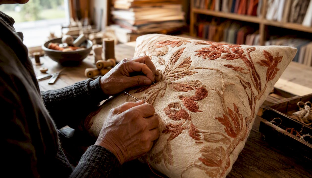
Createdecorus EEAT vignette. The handcrafted pillows and home accents from Createdecorus demonstrate material-driven accent differentiation at the product level. Each piece is produced in Mexico using artisan textiles, with deliberate choices around color saturation, weave texture, and trim detail that signal cultural heritage and craft quality. The specification process involves selecting yarns and dyes that carry the warmth of traditional Mexican artistry, then pairing them with premium memory foam and polyester fills that meet contemporary comfort standards. For a designer specifying these pieces in a client project, the documentation would include a material swatch, a scale overlay showing the pillow in context, and a note on the cultural provenance of the textile pattern. These details are not incidental; they are the accent's meaning. For designers sourcing handcrafted pieces for client projects, this level of specification transparency is what separates a meaningful accent from a generic decorative object.
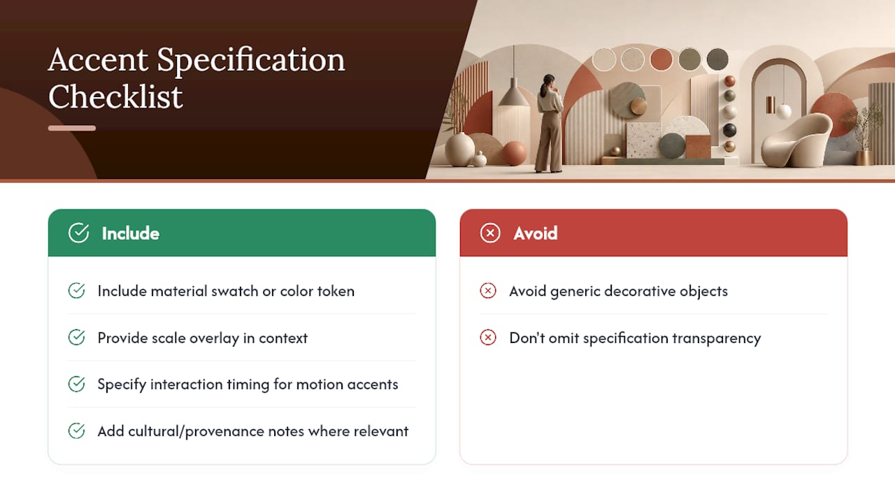
When writing a spec for any accent, include: material swatch or color token reference, scale overlay in context, interaction timing (for motion accents), cultural or provenance notes where relevant, and accessibility compliance notes.
Common mistakes and accessibility checks for accent use
Accents fail in predictable ways. Knowing the patterns helps you avoid them.
Common mistakes:
- Overuse: Applying an accent to too many elements dilutes its signal. If everything is accented, nothing is.
- Inconsistent application: Using an accent color for both interactive elements and decorative ones creates ambiguity about what is functional.
- Ignoring context: An accent that reads beautifully in a studio mock-up may disappear in the actual use environment (a dark room, a small screen, a noisy retail floor).
- Cultural misuse: Borrowing a pattern, color, or material from a specific cultural tradition without understanding its meaning risks offense and undermines authenticity. Celebrating cultural heritage through design requires genuine engagement with that heritage, not surface-level appropriation.
- Trend-chasing: An accent chosen because it is fashionable rather than because it fits the brand or audience will date the product quickly.
Accessibility checklist:
- Color contrast: non-text UI elements need at least 3:1 contrast against their background (WCAG 2.1 SC 1.4.11). Text accents need 4.5:1 for normal size, 3:1 for large.
- Motion: any motion accent must respect the
prefers-reduced-motionmedia query. Provide a static fallback. - Sound cues: any sound accent used to convey information must have a visual or text equivalent for users who cannot hear it.
- Tactile accents: in physical products, tactile differentiation (embossing, texture) cannot be the sole signal for users with reduced tactile sensitivity. Pair with visual differentiation.
- Cultural review: before finalizing a pattern or color accent with cultural associations, consult someone with direct knowledge of that tradition.
Pro Tip: Run a 5-minute accessibility smoke test before finalizing any accent: check contrast with a browser extension like Colour Contrast Analyser, toggle prefers-reduced-motion in DevTools, and view the design in grayscale to confirm the accent still communicates without color.
A 7-step checklist for implementing accent-driven differentiation
This checklist moves from brief to production specification. Work through it in order.
- Align on brief. Confirm the design problem the accent is solving: hierarchy, brand signaling, tier differentiation, or usability. One accent, one job.
- Map your audience. Write one sentence describing the segment the accent must resonate with. What do they value? What signals carry meaning for them?
- Select accent type. Choose from the taxonomy: color, material, texture, scale, pattern, typography, motion, or sound. Match the type to the medium and the audience's sensory context.
- Prototype in context. Build the accent into a realistic mock-up or physical sample. Never evaluate an accent in isolation.
- Test with real users. Run qualitative sessions (five to eight participants) and, where possible, a quantitative test. Track both behavioral and perceptual metrics.
- Write the production specification. Document the accent as a token (for digital) or a material specification (for physical). Include pairing rules, contrast ratios, scale guidance, and cultural or provenance notes.
- Establish governance. Decide who can modify the accent and under what conditions. Treat it as a governed dialect within your design system, not an open variable.
Involve a PM or project lead at steps 1 and 7, a UX researcher at steps 4 and 5, and a maker or manufacturer at steps 3 and 6.
Pro Tip: When briefing a studio or manufacturer on a material accent, send a physical reference alongside the specification document. Words like "warm terracotta" mean different things to different makers. A swatch eliminates ambiguity.
When accents are enough, and when they are not
The case for accent-driven differentiation is strong, and we believe in it. But it has limits that experienced designers should name clearly.
Accents are the right tool when the underlying system is sound and the problem is perception, not structure. If users understand the product but do not feel it, an accent can close that gap. If a product sits in a crowded market where everything looks the same, a well-chosen accent can create the distinctiveness that earns a second look and a higher price point.
Accents are not the right tool when the core experience is broken. A beautiful texture on a pillow that falls apart after six months is a broken promise. An elegant accent color on a UI that is fundamentally confusing to navigate does not fix the confusion. Accents amplify what is already there. They make good products feel exceptional; they make flawed products feel dishonest.
The decision rule I apply: if a user or customer can articulate what they want but cannot find it in your product, that is a structural problem. If they can find it but do not feel it, that is an accent problem. The two require different interventions, and conflating them wastes both time and budget.
Senior designers sometimes reach for a full system redesign when a governed accent change would do the job in a tenth of the time. The research supports starting smaller. Test one accent change, measure the perceptual and behavioral shift, and let the evidence tell you whether you need to go deeper.
Createdecorus: handcrafted accents with a distinct point of view
Most home accents on the market are produced at scale, which means the accent that is supposed to make your space feel personal ends up in a hundred other rooms. Createdecorus takes a different path.

Every pillow and ottoman in the Createdecorus collection is handcrafted in Mexico using artisan textiles that carry genuine cultural heritage. The color choices, weave textures, and trim details are not trend-driven; they are rooted in traditional Mexican artistry passed down through generations. For interior designers and homeowners who want an accent that holds its meaning over time, that provenance matters. Wholesale and trade pricing are available for designers sourcing pieces for client projects. Browse the full collection or shop all pillows to find the accent that fits your brief.
Sources
- Raising the ceiling: the impact of design-based differentiation on product pricing
- Same or Different? An Aesthetic Design Question
- Accents — Atlassian Design
- Design Dialects: Breaking the Rules, Not the System