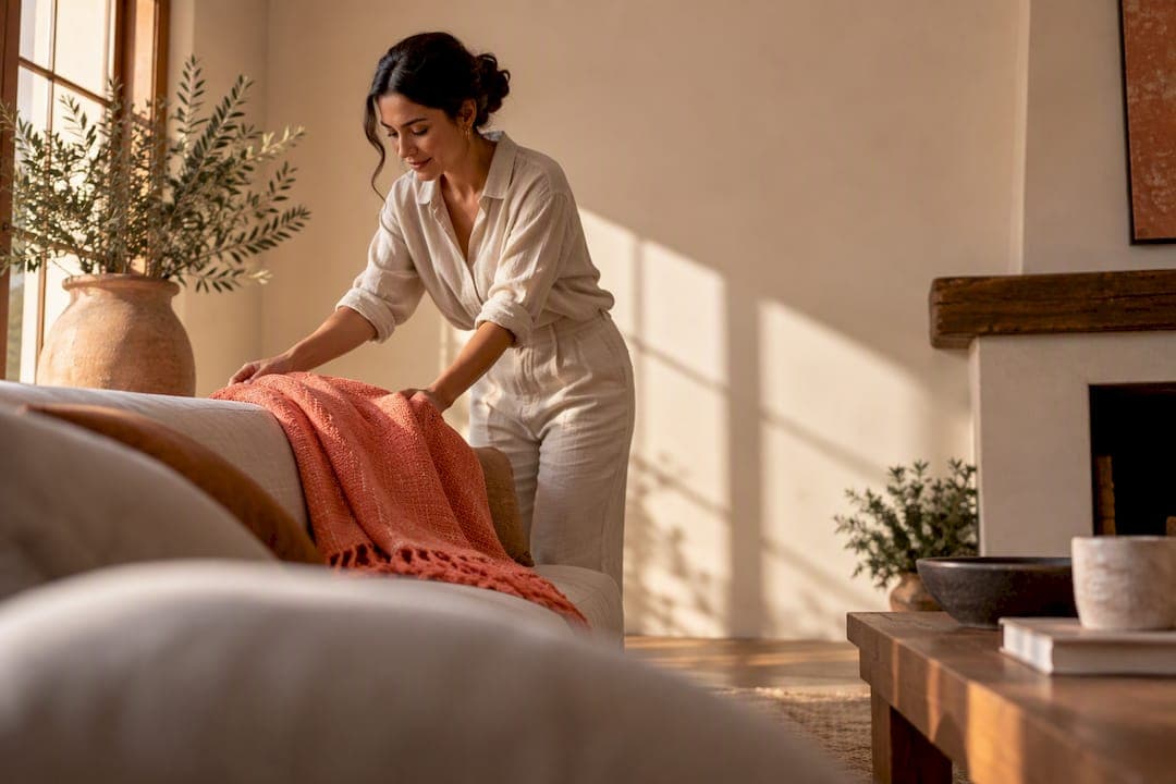
Yes, vivid color belongs in the living room, and the surest way to use it is through focused accents rather than full saturation. A statement rug, a handcrafted pillow, or a single bold wall against a calm neutral backdrop gives you the drama without the risk. The sections ahead walk through named palettes, step by step execution, and the pieces that make it easy to commit to color without repainting a thing.
TL;DR:
- Vivid colors work best when used as accents through textiles, art, or decorative pieces rather than covering entire walls or large furniture.
- Mustard, coral, and turquoise create warm, social moods, while mint, sky blue, and chartreuse promote calmness and reduce stress.
- Pair vivid hues with natural materials like wood, stone, or wool to soften saturation and create a more balanced, livable space.
- Testing paint or fabric samples in your room's actual light conditions ensures the color maintains its intended effect before committing.
- Limiting the palette to one dominant, supported by neutral tones and repeating key colors in accessories prevents overwhelming the space.
Table of Contents
- Which vivid color palettes work best in a living room
- How do you actually introduce vivid color into a room?
- Which color combinations reliably work with vivid hues
- Grounding bright colors with the right materials and textures
- How lighting changes the way vivid colors read
- Ready-to-use palettes for different moods
- Common mistakes with vivid color and how to fix them
- What handcrafted accents bring to a vivid room
- A personal note on color, restraint, and where it comes from
- Bring these palettes home without a full renovation
- Where to read more on color and design
- Sources
- FAQ
Which vivid color palettes work best in a living room
Choosing a direction starts with mood, not a paint chip. The tone you pick shapes how a room feels the moment someone walks in, and different vivid families carry different emotional weight.
Joyful palettes built on mustard, coral, and turquoise suit living rooms meant for gathering. These tones read warm and social, and they photograph beautifully against white walls or light oak floors. Mustard works particularly well as an armchair or ottoman color because it holds up visually against both wood and stone.
Calmer vivid tones, mint, soft chartreuse, and sky blue, bring energy without the intensity. Research into color and well-being found that lighter vibrant hues such as blue, green, and yellow consistently support physiological calmness and reduced stress, which makes them a smart choice for a living room that also needs to function as a place to unwind. The same research notes that deeper, more saturated tones like red tend to increase arousal, so they read best in small doses layered against neutral surfaces rather than spread across a whole wall.
Jewel tones, emerald, cobalt, and ruby, deliver the most dramatic effect and reward a heavier hand with texture. Velvet holds these colors beautifully, deepening them in low light and catching highlights when the sun hits. Lacquered finishes push jewel tones toward glamour, while a matte or eggshell paint keeps them grounded and livable.
A few practical notes on fabric choice:
- Velvet intensifies jewel tones and adds a tactile richness that suits emerald, cobalt, and ruby.
- Linen softens brighter joyful tones like coral and mustard, keeping them casual rather than formal.
- Performance fabrics hold saturated color well in high-traffic rooms and resist fading better than raw cotton.
- Wool grounds vivid rugs and throws with texture that reads warm even in cooler hues like sky blue.
The finish you choose changes how long the color holds its punch, so it is worth thinking past the swatch and into daily use before committing to a full piece of furniture in a saturated hue.
How do you actually introduce vivid color into a room?
Adding color works best as a sequence, moving from low commitment to high commitment as confidence builds. Here is a practical order of operations:
- Start with textiles. Bring in a bold pillow, throw, or lampshade first, since these are the easiest and least expensive way to test a hue in your actual space.
- Add a showpiece. Once a color feels right, commit to one larger anchor: a bold sofa, an accent armchair, or a statement rug.
- Layer in art. Wall art in a matching or complementary tone reinforces the palette without adding another surface commitment.
- Consider the wall itself. Paint, wallpaper, or a paneled accent wall is the biggest commitment, so save it for once you know the color reads well in your light.
- Sample before you commit. Test paint or fabric swatches against your actual walls and furniture, in daylight and under your evening lighting, before buying in bulk.
Accent walls deserve a closer look because they carry the most risk and the most reward. Paint is reversible and cheap to redo, which makes it the right choice for experimenting. Wallpaper adds pattern and depth but costs more to remove later, so it suits a color and design you are confident about. A paneled accent wall in a saturated stain sits between the two: more permanent than paint, but more textural than either option alone.
Designers who work with strong color often describe their approach as judicious editing: build from a neutral base, then concentrate saturation in a few focal points rather than spreading it evenly across the room. That principle, drawn from designer commentary on color drenching and restraint, applies just as well to a single bold pillow as it does to an entire painted wall.
For readers looking for a faster path, a weekend refresh with tactical changes can introduce vivid color without touching a single wall.
Pro Tip: Buy the smallest usable sample size of a paint or fabric before committing, and live with it in the room for at least three days across different light conditions.
Which color combinations reliably work with vivid hues
Pairing rules take the guesswork out of vivid color. The simplest and most forgiving system uses three parts: one dominant hue, one supporting saturated hue, and a neutral rest tone that covers the majority of the room. This keeps the palette from feeling scattered while still allowing real vibrancy.
A few combinations that consistently work in real rooms:
- Emerald and blush, grounded by warm white walls, suits smaller living rooms where you want richness without visual weight.
- Cobalt and mustard, paired with black accents and light wood, works well in larger rooms with good natural light.
- Coral and turquoise, softened by a sandy neutral, brings a relaxed, almost coastal energy that suits rooms with lower ceilings.
- Ruby and forest green, balanced with cream and brass, reads formal and suits rooms used for entertaining more than lounging.
- Terracotta and sky blue, anchored by unfinished wood, holds up in low light because both tones carry enough warmth to avoid feeling flat.
Pattern mixing works best when at least one color repeats across two or more patterns in the room, since that repetition is what keeps a bold room feeling curated rather than chaotic. Designers frequently recommend repeating a single vivid hue across accessories in adjacent spaces, which creates a sense of flow between the living room and whatever space sits next to it, rather than treating each room as an isolated color experiment.
Grounding bright colors with the right materials and textures
Vivid color needs a counterweight, and the most reliable one is natural material. Wood, stone, rattan, and wool all carry visual texture that softens saturation without dulling it, which is why a bold emerald sofa against a walnut coffee table feels rich rather than loud.
Specific pairings worth trying:
- Emerald with walnut creates warmth and depth, since the wood's reddish undertones complement the cool green.
- Coral with terracotta feels cohesive because both sit in the same warm family, just at different intensities.
- Cobalt with raw linen softens a strong blue and keeps a room feeling relaxed rather than formal.
- Mustard with woven rattan plays up the earthy side of yellow, which helps the color feel grounded rather than electric.
Scale matters as much as material. A large-scale pattern in a saturated color reads bolder and busier, while the same hue in a fine weave or small repeat feels calmer, even at full intensity. Design analyses of livable spaces have found that layering natural materials with vivid color reduces the visual noise that comes from saturated surfaces, which is part of why a stone fireplace or a rattan chair can make an otherwise intense palette feel settled rather than overwhelming.
How lighting changes the way vivid colors read
Light changes color more than most people expect, and it is the single biggest reason a paint swatch looks different on the wall than it did in the store. Warm bulbs intensify reds, oranges, and yellows, while cool bulbs push blues and greens toward their sharper, more clinical side. Strong natural sunlight amplifies warm saturated tones especially, so a coral or mustard that looks balanced on an overcast day can read much brighter once direct sun hits it.
Testing color samples under your own room's actual light, at different times of day, remains the most reliable way to avoid a costly mistake. Paint a swatch large enough to judge, then check it in the morning, at midday, and again once your lamps are on in the evening. A statement lighting approach can shift how a vivid color reads after dark just as much as sunlight shifts it during the day.

For fixtures, warm-toned bulbs in the 2700 to 3000 Kelvin range tend to flatter reds, corals, and mustards, while cooler bulbs above 4000 Kelvin suit blues and greens better. A well-placed modern wall light can also soften a saturated accent wall in the evening, keeping the room from feeling stark once the sun goes down.
Ready-to-use palettes for different moods
Three palettes cover most of what readers are looking for, each built around a standout piece and a grounding material so the whole look can be assembled without guesswork.
- Calm bright: sky blue, soft mint, and warm white. Standout piece: a sky blue accent chair. Grounding materials: light oak floors and a wool rug in a neutral tone.
- Joyful bold: mustard, coral, and cream. Standout piece: a mustard sofa or a coral statement rug. Grounding materials: rattan side tables and linen curtains.
- Dramatic jewel: emerald, cobalt, and charcoal. Standout piece: an emerald velvet sofa or a cobalt accent wall. Grounding materials: walnut furniture and a stone or concrete fireplace surround.
The calm bright palette suits smaller apartments and rooms that double as a home office, since the lower intensity keeps the space from feeling stimulating late in the day. The joyful bold palette fits family living rooms built for gathering, where warmth and energy matter more than restraint. The dramatic jewel palette works best in larger rooms with good natural light and higher ceilings, since the depth of the colors needs room to breathe rather than feeling boxed in.
Trend coverage of 2026 living room design points to a similar pattern: rooms that mix jewel tones, pastels, and layered patterns tend to feel curated rather than accidental, largely because the palette stays limited even as the individual pieces get bolder.
Common mistakes with vivid color and how to fix them
The most common mistake is over-saturation: painting every wall, choosing multiple bold furniture pieces, and layering unrelated hues until the room feels loud rather than lively. A close second is ignoring scale and light, choosing a color that looked right on a small swatch but overwhelms a full wall in direct sun.
A three-step edit checklist helps restore balance once a room feels off:
- Remove one saturated element and see if the room breathes better, since often a single piece is doing too much work.
- Check your neutral ratio. A vivid room usually needs 70 to 80% neutral surfaces to keep the color feeling intentional rather than chaotic.
- Repeat, don't multiply. If you have more than two or three unrelated saturated hues in one room, pick a dominant one and let the rest fade into supporting roles.
Before repainting or replacing a major piece, pause and test. Live with the room for a week, notice which colors you keep looking at with pleasure and which ones you have started avoiding, and let that guide the edit rather than starting over from scratch.
Pro Tip: If a room feels off but you cannot pinpoint why, take a photo and convert it to grayscale. Uneven contrast between elements often reveals a scale or saturation mismatch that is hard to see in color.
What handcrafted accents bring to a vivid room
A single handcrafted pillow or rug can anchor an entire palette, giving a room its dominant hue without asking anyone to commit to a full renovation. Repeat that same hue across a second pillow, a throw, or a piece of wall art, and the room starts to feel composed rather than assembled piece by piece.
The brand builds its pillows, rugs, and wall art around exactly this kind of repeatable color story, with each piece handcrafted using artisan-inspired textiles and premium materials. Because the pieces are made to be swapped in and out, they let a homeowner test a jewel tone or a joyful palette without touching paint or furniture. The role accent pieces play in a room becomes especially clear once you see how much one well-placed rug or pillow can shift a room's entire mood. For a closer look at how textiles specifically carry that weight, decorative pillows and their styling role covers the mechanics in more depth.
A personal note on color, restraint, and where it comes from
Dopamine decor, at its best, is not about excess. It is about choosing a color that genuinely lifts your mood and giving it room to matter, rather than drowning it in five other competing hues. Vivid color has long carried meaning beyond decoration, and that cultural weight is part of why a bold room can feel personal rather than trendy.
Restraint is what separates a curated room from a chaotic one. Pick the hue that means something to you, repeat it with intention, and let the neutral surfaces do their quiet work around it. Try one accent this month, live with it, and see how the room shifts.
— Ernesto
Bring these palettes home without a full renovation
Once you know the palette you want, the fastest way to bring it into the room is through pieces made to carry color well. This company builds handcrafted pillows, rugs, wall art, and wallpaper specifically for this kind of focused, low-risk color introduction, so you can test a jewel tone or a joyful palette without repainting a single wall.

- For the calm bright palette, start with Decor Pillows in mint or sky blue tones to test the mood before committing further.
- For the joyful bold palette, a mustard or coral piece from the Rugs collection anchors the room and pulls the rest of the palette together.
- For the dramatic jewel palette, Wall Art in emerald or cobalt tones adds depth without the commitment of an accent wall, and Wallpaper offers a way to bring that same intensity to a full surface when you are ready.
- Readers drawn to bold pattern rather than solid color might look at the Animal Print Pillow Collection for a different kind of statement piece.
Custom orders and trade pricing are available for designers and boutiques working across multiple rooms. Visit the shop to see current pieces and find the one that fits the palette you have chosen.
Where to read more on color and design
- The influence of color on well-being covers how different saturated hues affect mood and stress.
- Designer commentary on color drenching explains the restraint principle behind sophisticated bold rooms.
- Bold and joyful interiors from Kate Lovejoy shows the dopamine decor trend in practice.
- Colorful living room ideas for 2026 offers real-room examples of layered vivid palettes.
Sources
- The Influence of Colours on Well-Being: Psychological and Physical Health
- Kendall Wilkinson on color drenching with restraint
- Bold & joyful colour - Kate Lovejoy Interiors
- Colorful living room ideas for 2026
FAQ
¿Qué color se ve bien en una sala?
Depends on the mood you want, but mustard, coral, and emerald all read well against neutral walls and natural materials like wood or stone. The right choice usually comes down to whether you want warmth and energy or depth and drama.
¿Qué colores relajan en la sala de estar?
Lighter vibrant tones such as blue, green, and yellow tend to support calm and lower stress more reliably than deep saturated hues like red. Soft mint, sky blue, and pale chartreuse are common choices for a relaxed living room.
¿Cuál es el color ideal para un living?
There is no single ideal color, since the best choice depends on room size, natural light, and personal preference. A calm bright palette suits smaller rooms, while a dramatic jewel palette tends to work better in larger spaces with more natural light.
¿Cuáles son los 3 colores más llamativos?
Definitions vary, but among the most commonly cited high-impact hues in interior design are cobalt blue, emerald green, and ruby red, largely because of their depth and intensity in velvet or lacquered finishes. Mustard and coral are also frequently grouped among the boldest choices for a joyful, rather than dramatic, palette.
¿Cómo evito que una sala con colores vivos se vea sobrecargada?
Keep neutral surfaces at roughly 70 to 80% of the room and repeat one or two dominant hues across accessories instead of introducing several unrelated colors. Testing samples under your actual lighting before committing also helps catch a color that reads more intense than expected.